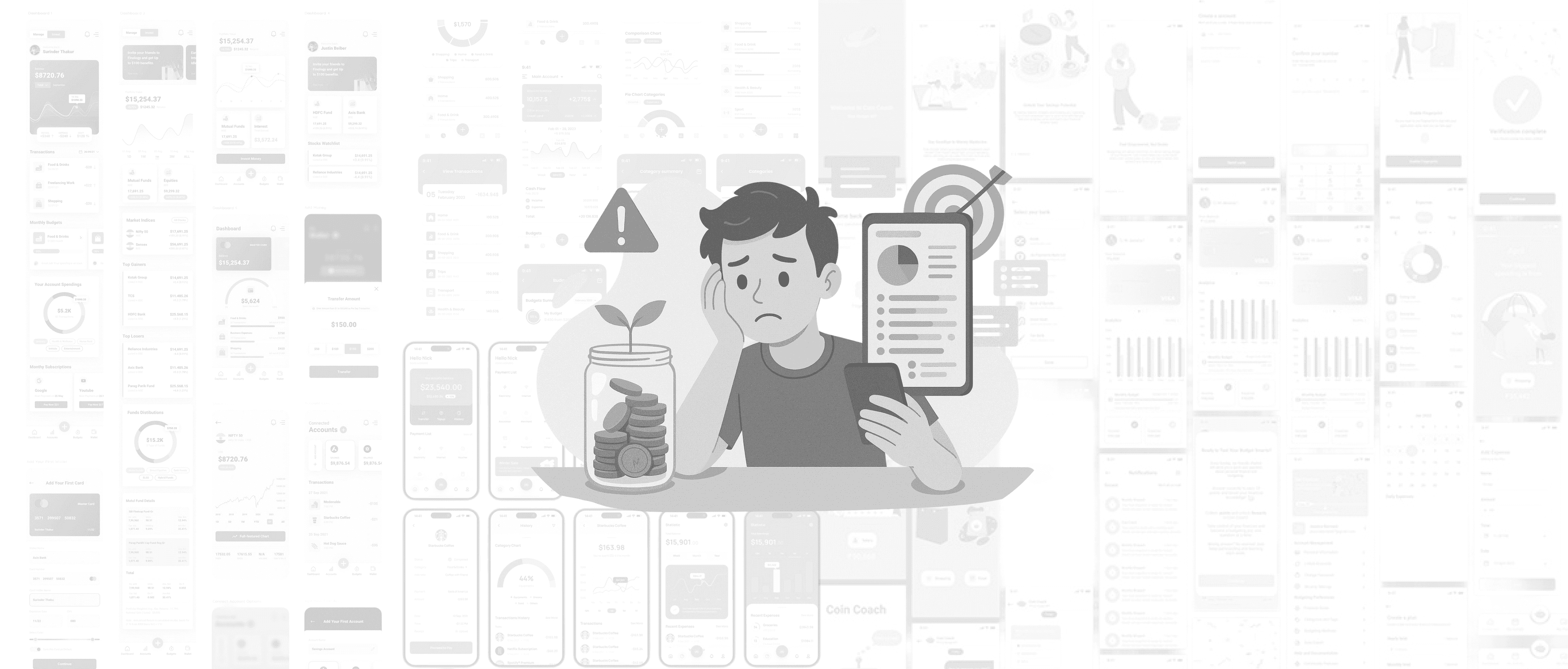
Nutra — fintech for everyone
A budgeting app for the rest of us. Gamified, friendly, built for people who want to save but can't sustain it. 85% of testers reported higher motivation; 90% loved the play of it.
- Role
- UI/UX & Product Design
- Period
- Aug 2024
- Client
- Aspen Lab
- Themes
- Fintech · Gamification · UX research
- +0%
Self-reported motivation lift
- 0%
Positive feedback on usability
- End-to-end
Design system surfaces
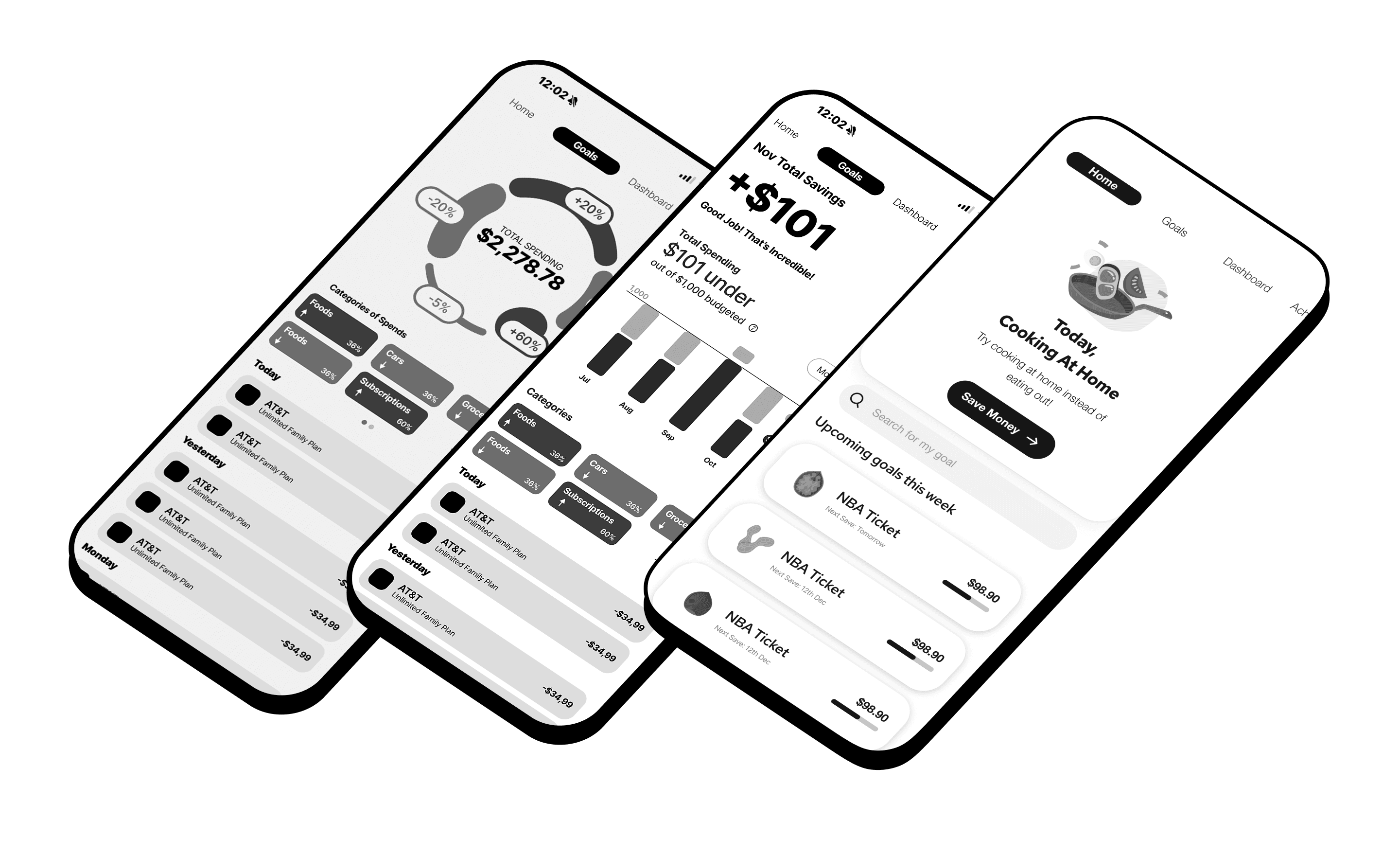
01
Problem
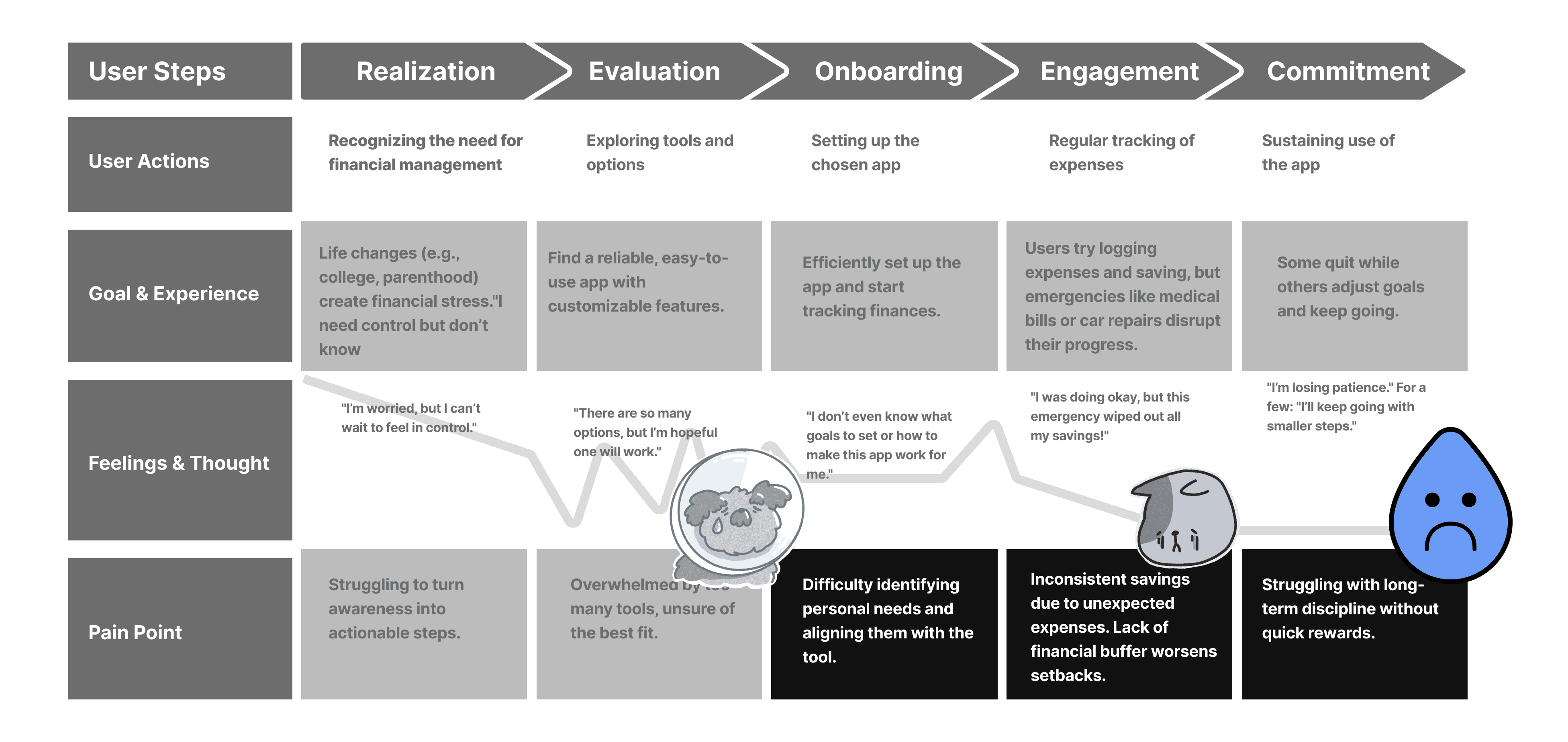
Budgeting matters but it's hard, especially for new learners. Most apps are overwhelming because they're built for the highly disciplined. The people who most need help — the ones who want to save but can't stay consistent — are the ones who quietly drop out first.
02
Research
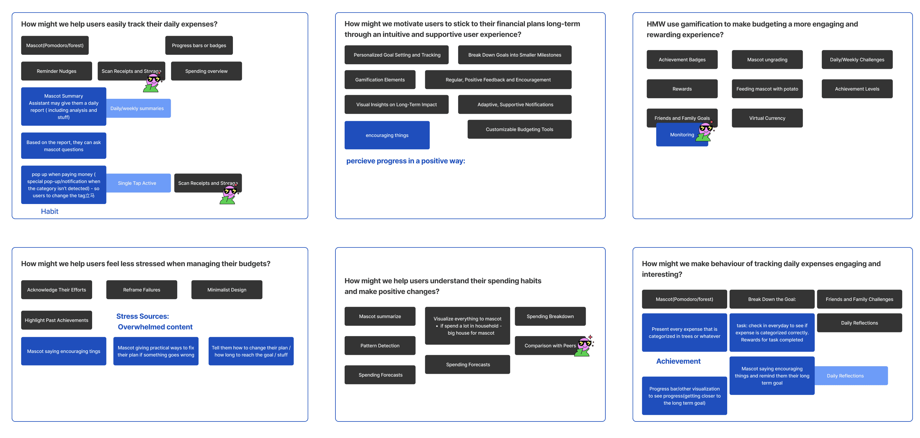
Surveys and in-depth interviews with self-identified low-motivation, low-discipline users surfaced three insights: simple intuitive interactions reduce overwhelm; gamification mechanics significantly boost engagement; and small, personalized nudges drive consistency. We were looking at a large, underserved group whose biggest enemy was friction.

03
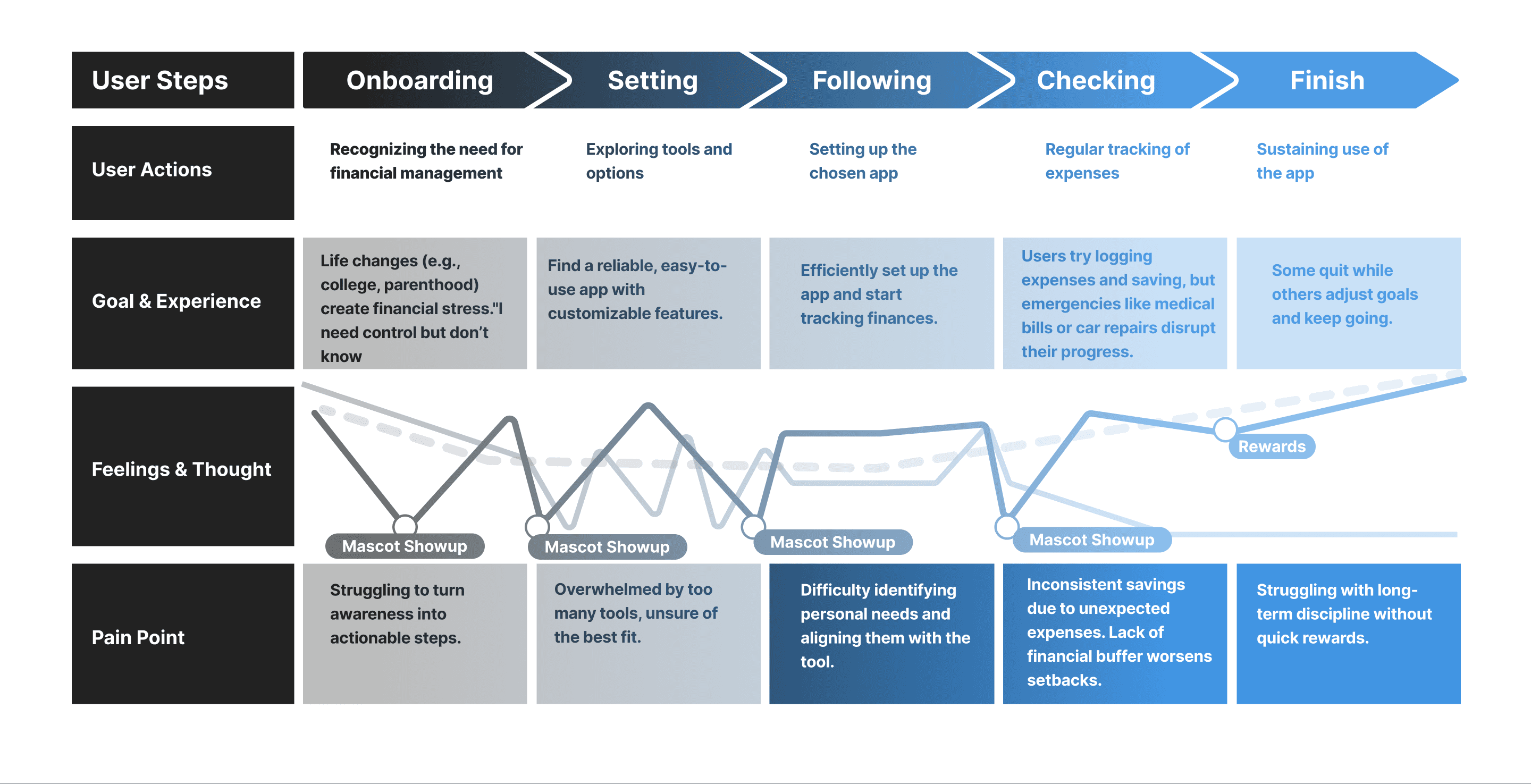
Mental model & journey
We mapped how target users think about money — separating the cognitive cost of saving from the emotional cost of being told they aren't saving enough. The journey map made the friction points visible.
04
Market opportunity
Mainstream budgeting apps over-index on the disciplined power user. Nutra targets the much larger unmotivated middle — people who already want to save but can't sustain attention without a feedback loop.
05
Design objectives
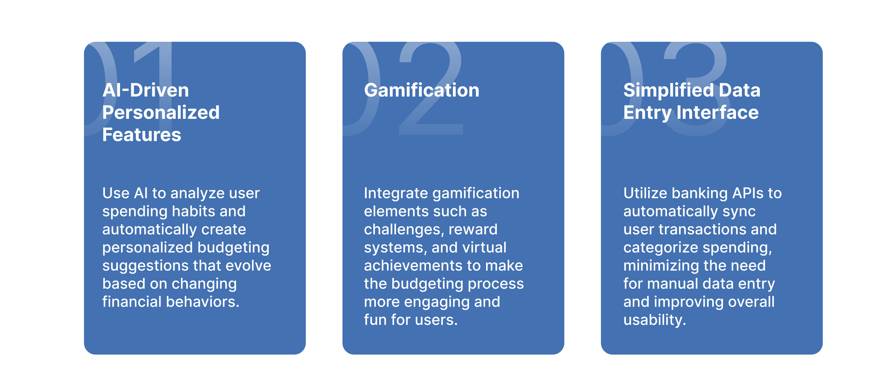
Lower the entry barrier — minimize cognitive load, frictionless onboarding. Boost engagement through daily saving challenges, interactive rewards, playful rituals. Personalize tasks and suggestions based on individual spending patterns and goals.
06
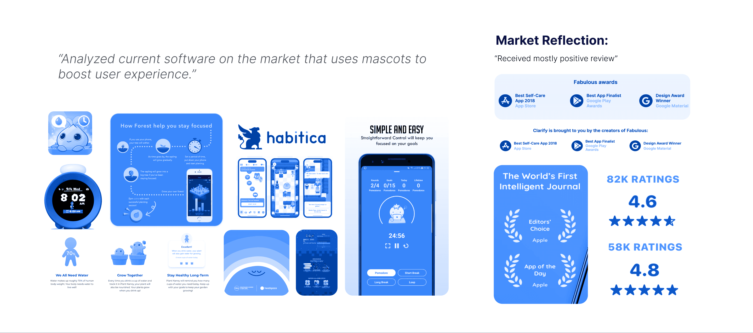
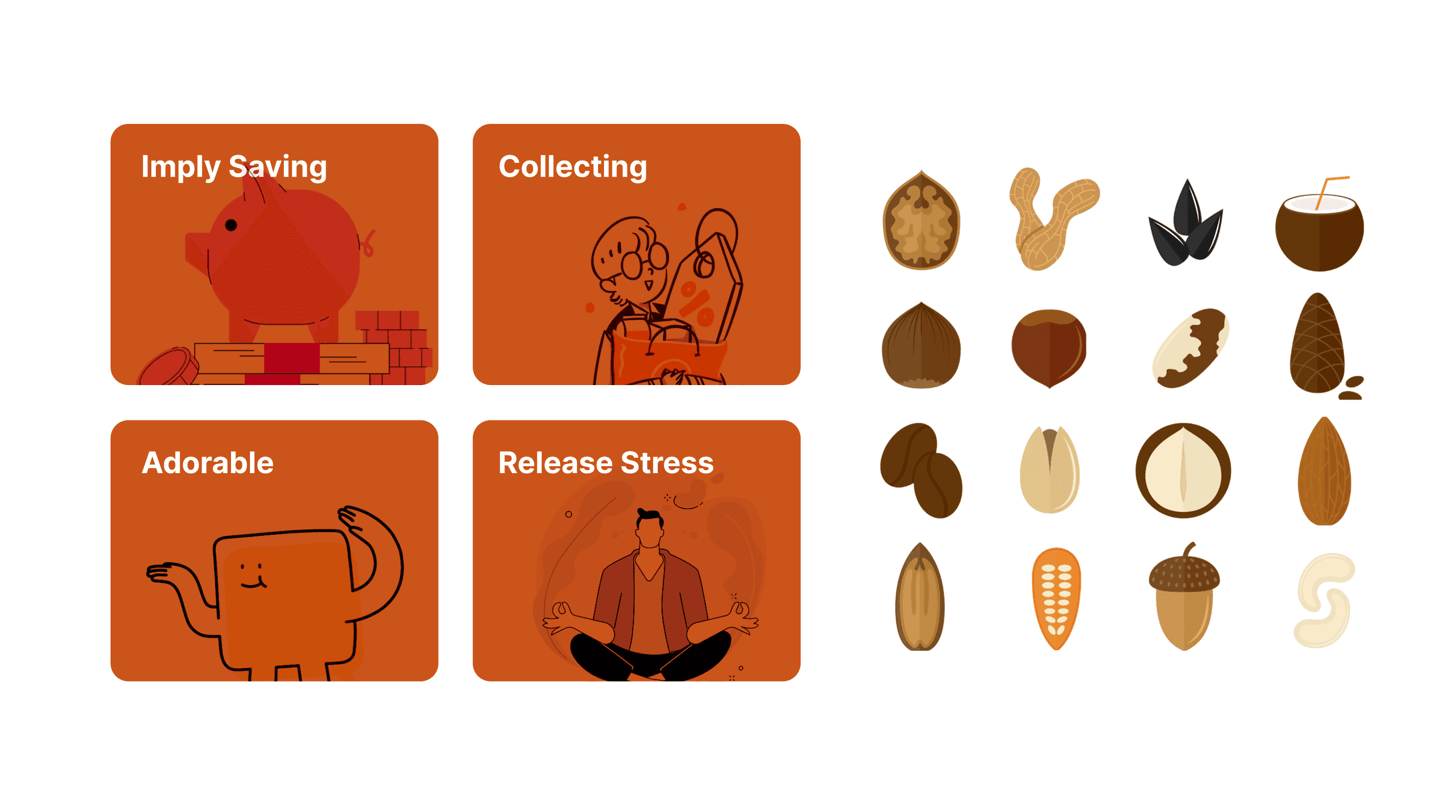
Why gamification
Budgeting fails when it feels like a chore. Gamification makes the loop short, visible, and rewarding — turning discipline into habit and improving long-term retention by orders of magnitude.
07
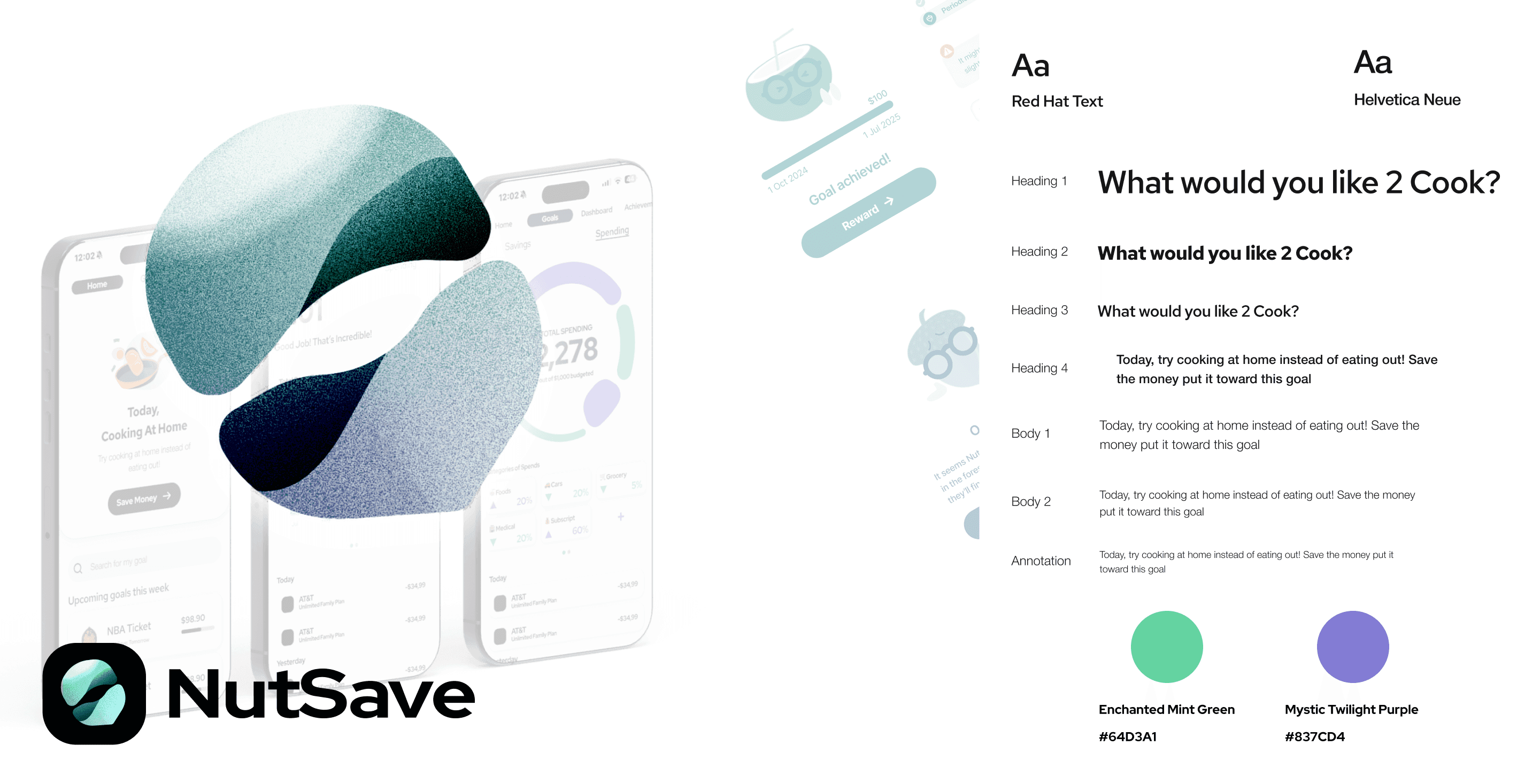
Why "Nut"
We chose Nut as the virtual assistant because it symbolizes growth, saving, and potential — a small thing that becomes something bigger. The metaphor makes financial progress feel tangible, approachable, and friendly.
08
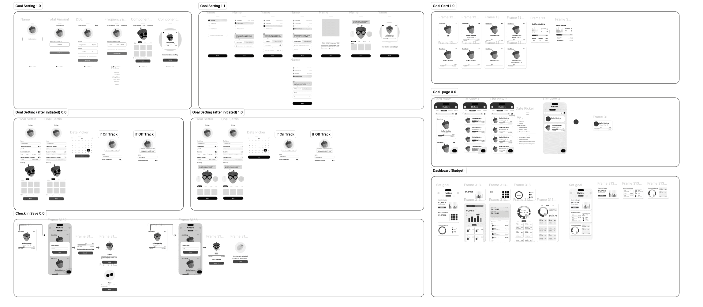
Ideation
Two parallel flows: dashboard discovery (where money is going right now) and goal setting (where it should be going). Sketched dozens of variations to find the smallest viable interaction loop.
09
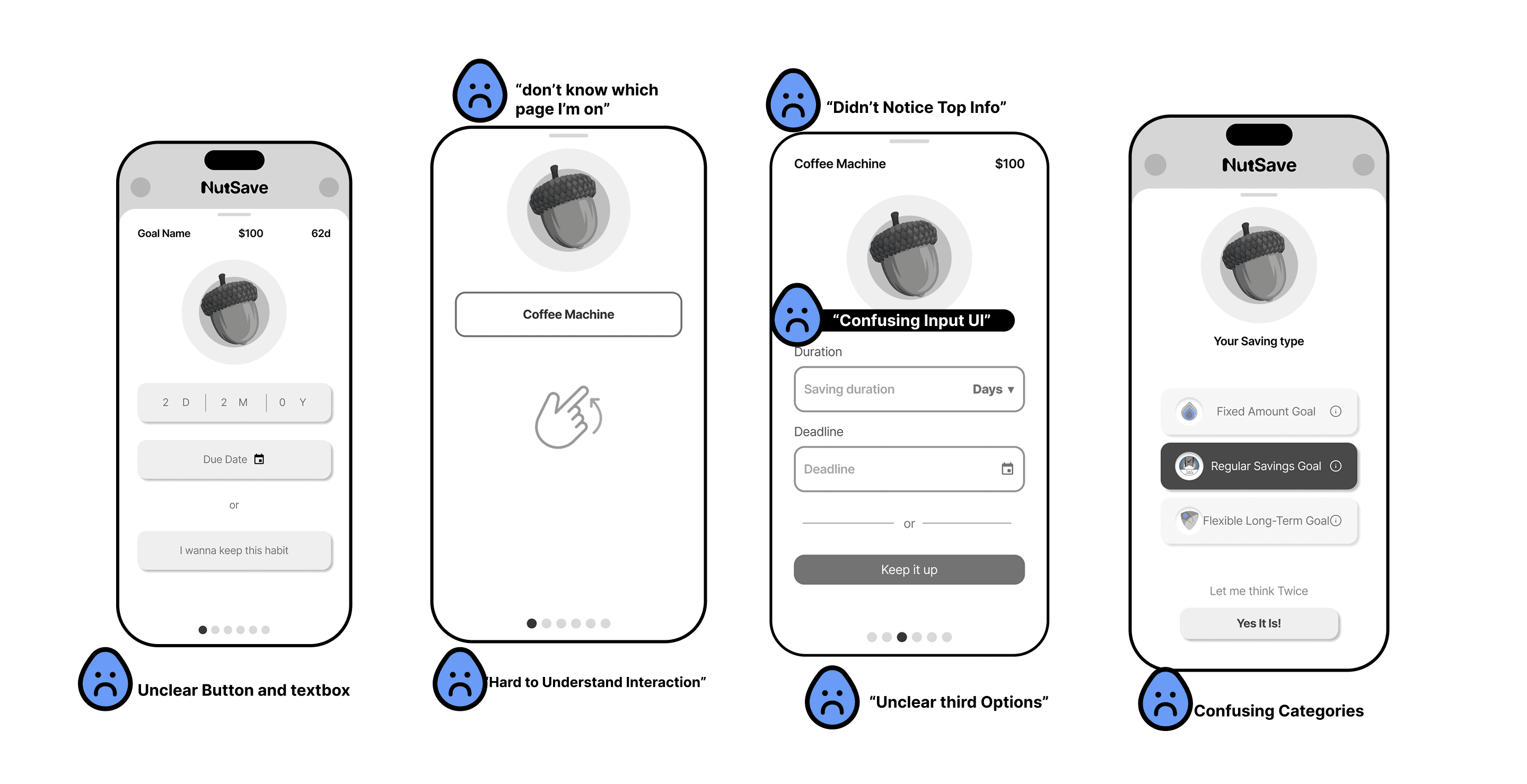
First user test
A low-fi clickable prototype, run with target users to validate the underlying UX bones before any visual investment.
10
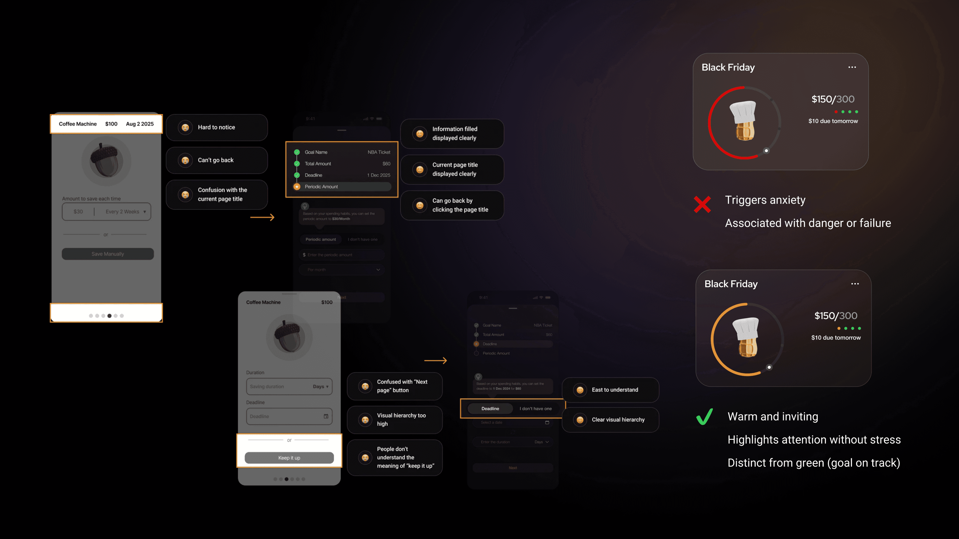
Refinement
First-test friction points: the goal flow asked for too much upfront, the dashboard buried the next action. We rewrote the onboarding sequence and gave the daily challenge top billing.
11
Lo-fi summary
Final lo-fi structure: dashboard, daily challenge, goal setter, Nut assistant, financial overview. Once this held, the brand layer could go on top.
12
User journey, after
Post-test, the journey collapsed: fewer screens between intent and feedback, fewer dead ends, a clear path from open-app to saved-money.
13
Mid-fi & branding
Layered the brand voice on once the structure held. Nut got a personality. Color and motion stayed restrained so the play felt warm, not loud.
14
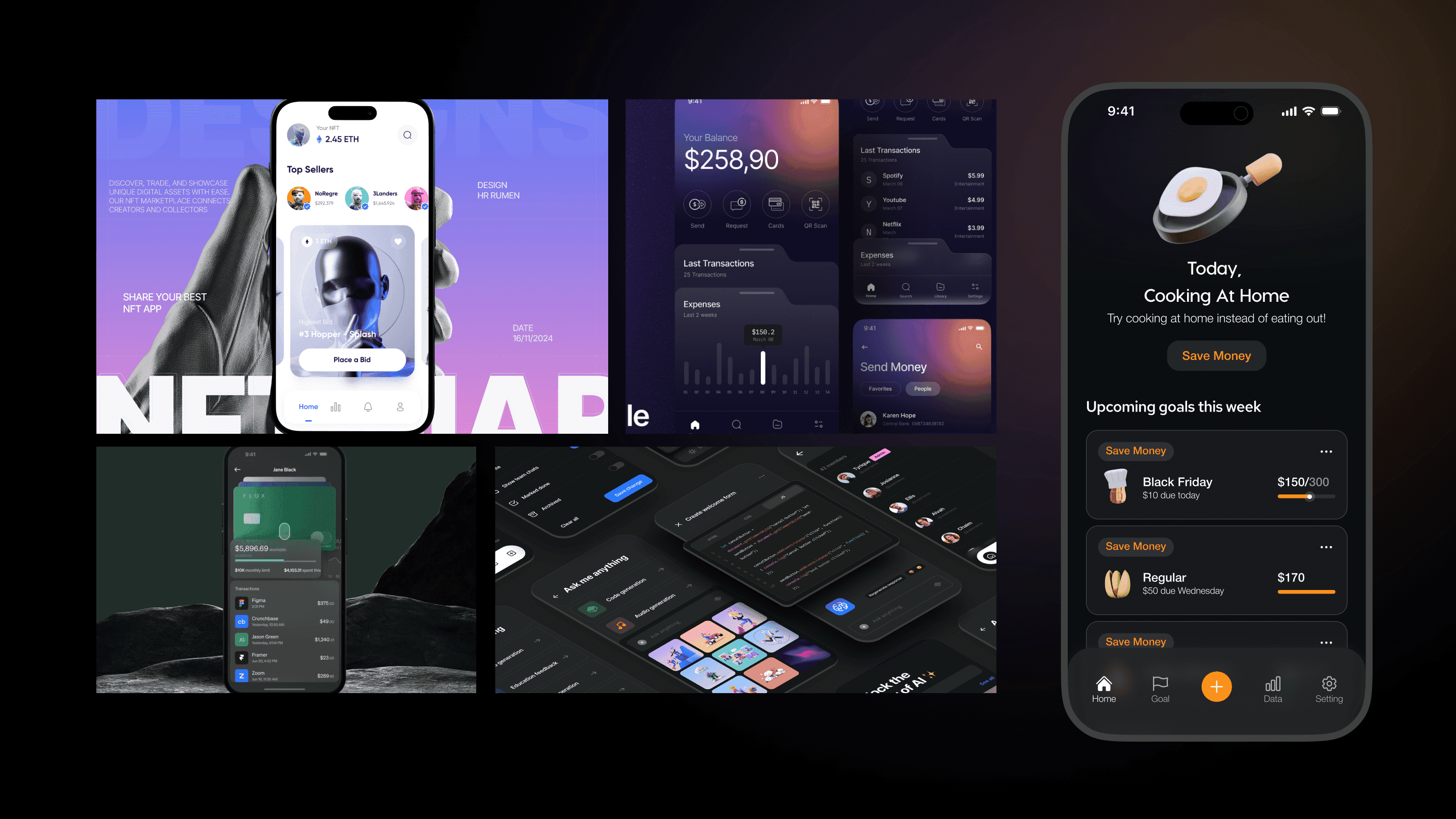
Mockup
Hero composition for the launch page — Nut, dashboard, daily challenge, all visible in a single read.
15
Branding 2.0
Second pass on visual identity. Tightened the mascot proportions, locked the color system, and built out a small expressive set of emotional states for Nut.
16
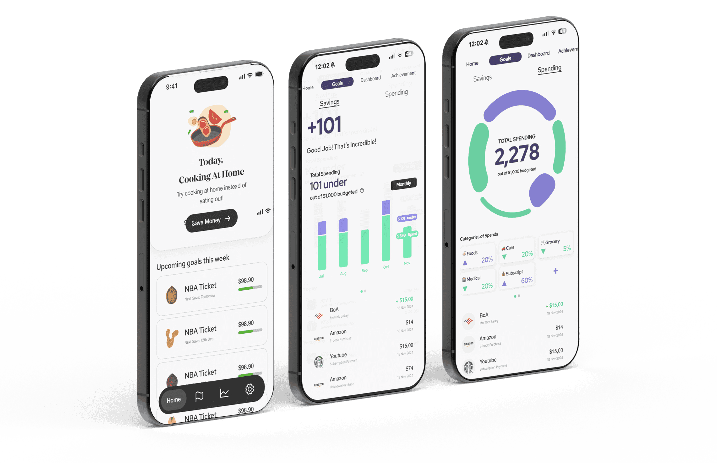
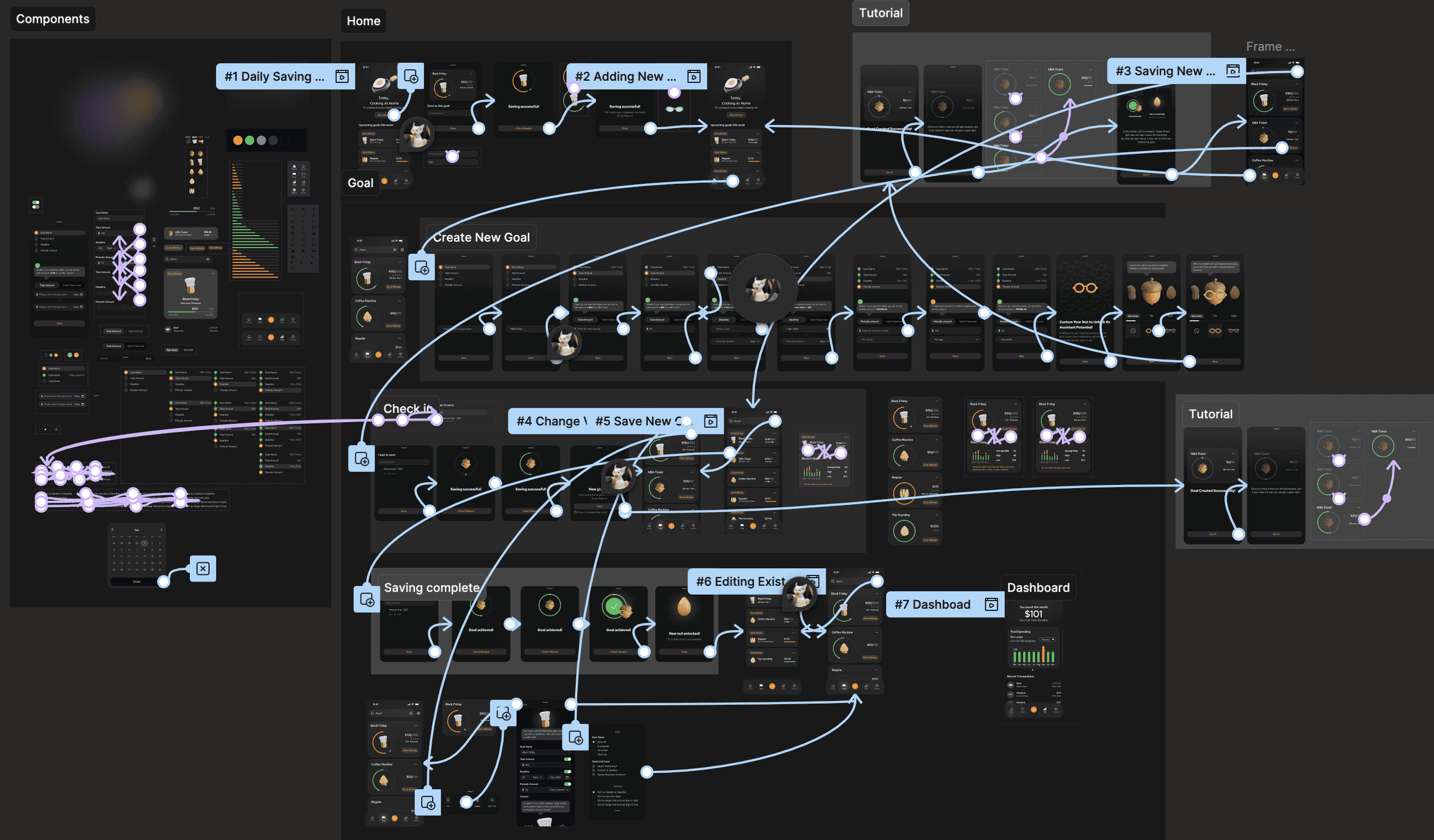
Hi-fi user flow
End-to-end flow for the hi-fi prototype, covering onboarding, goal setting, daily check-in, and the financial overview.
17
What shipped
Goal Setting (personalized, manageable steps). Daily challenges based on the user's spending pattern. The Nut assistant for visual reward and emotional feedback. A clear financial overview as honest data viz of habits, budgets, and progress. A full design system to keep it coherent across surfaces.
18
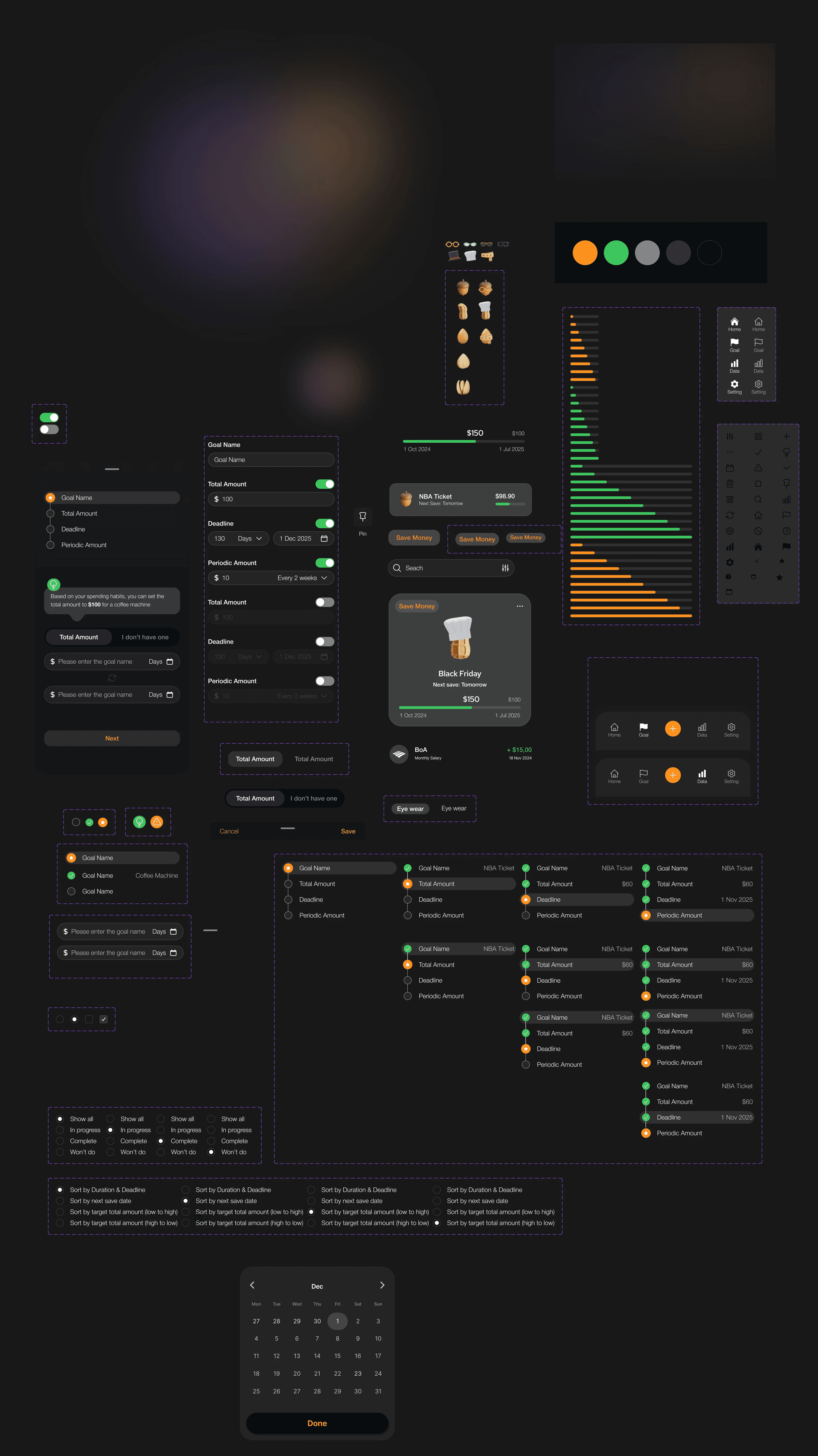
Design system
Comprehensive guidelines to keep visual and interactive consistency across surfaces — color, type, components, motion tokens, and the rules for Nut as a system primitive.
19
Validation
Multiple rounds of usability testing with target users refined the interactions. The result: stronger retention through play, observable improvements in saving behavior among users who'd previously bounced off discipline-heavy apps, and overwhelmingly positive feedback.
20
Reflection
Designing Nutra deepened my understanding of behavioral psychology and how gamification really works in motivation. It strengthened my UX research, iterative prototyping, and visual-system muscles — and showed how care plus play can ship something both effective and joyful.