Hyundai IONIQ 6 — designing for trust at L2+
A sponsored HMI project exploring driver confidence in Hyundai’s HDA 2.0 system. Real-driving research, simulator testing and three interface directions shaped an adaptive instrument cluster for the IONIQ 6.
- Role
- HMI Designer
- Period
- Jan — May 2025
- Client
- Hyundai
- Themes
- HMI design · Driving research · Interactive prototyping
- +0%
Confidence score vs. original UI · prototype study
- 0
Interface directions tested
- 0
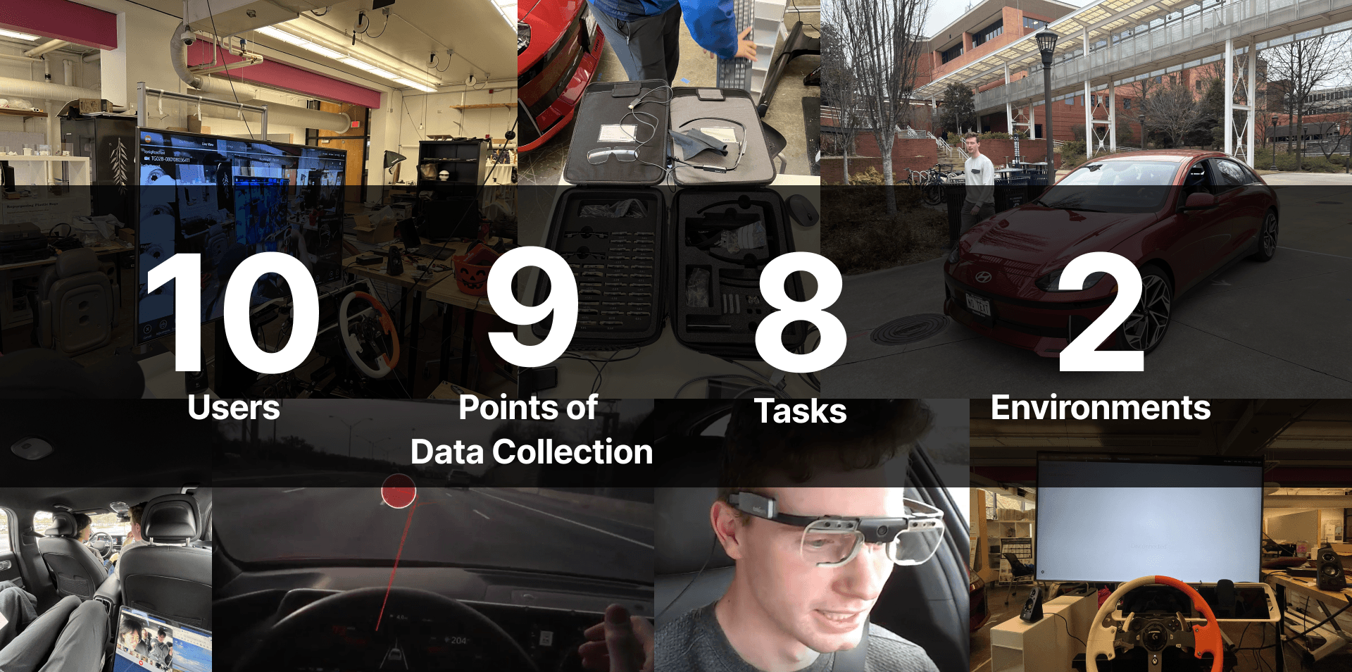
Test environments · real car & simulator
01
Clarity at the handoff
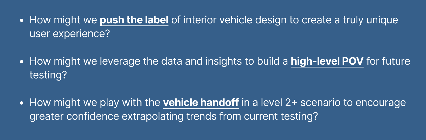
How might we help drivers feel more confident when control shifts between the human and Hyundai’s HDA 2.0 system? This sponsored HMI project explored the IONIQ 6 experience in Level 2 and Level 2+ assistance scenarios, focusing on system status, information hierarchy and feedback at critical transitions.
02
Understand the people around the system
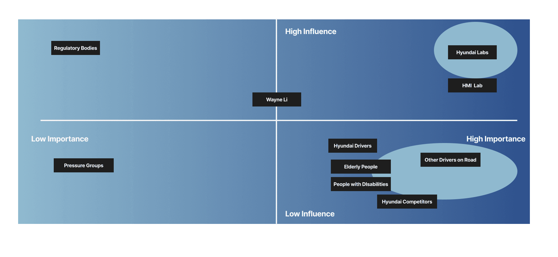
The stakeholder map placed Hyundai and the HMI lab alongside drivers, other road users, regulators and groups with different accessibility needs. It helped frame the interface as part of a wider driving experience, with expectations that extend beyond the person looking at the cluster.
03
Observe driving in two environments
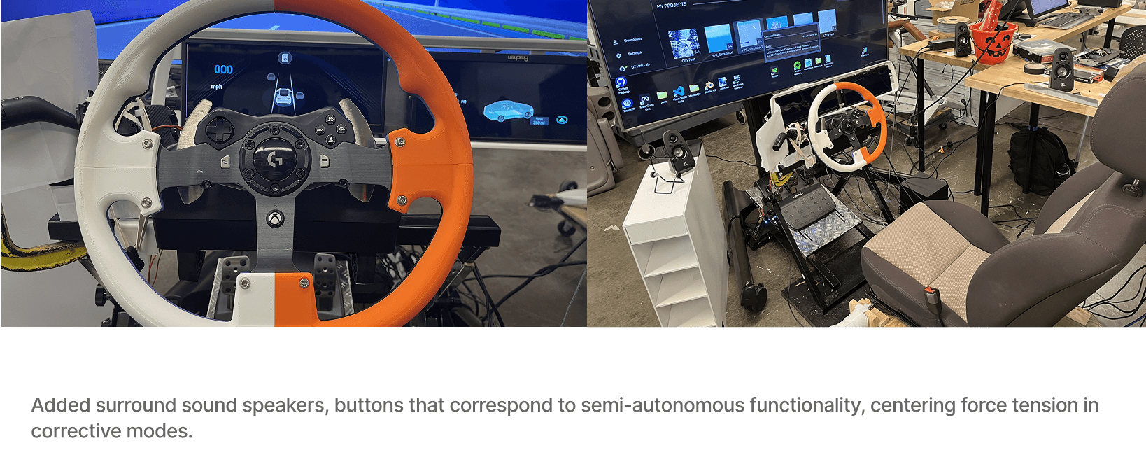
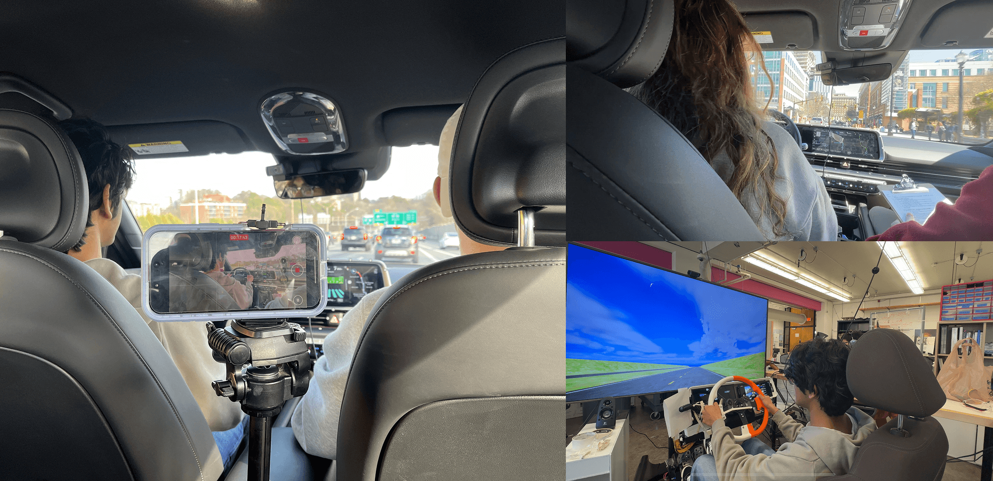
Drivers completed tasks in both a real vehicle and a custom Unreal Engine simulator. The setup combined ECG-based heart-rate variability, Tobii eye tracking and self-report surveys. A steering rig, highway rendering and surround sound allowed the team to explore assistance behavior in a repeatable setting before comparing it with the real-driving experience.
04
Combine workload, behavior and feedback
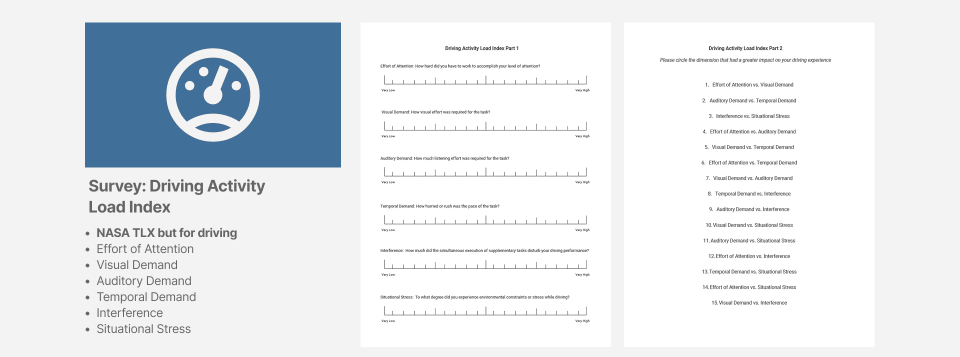
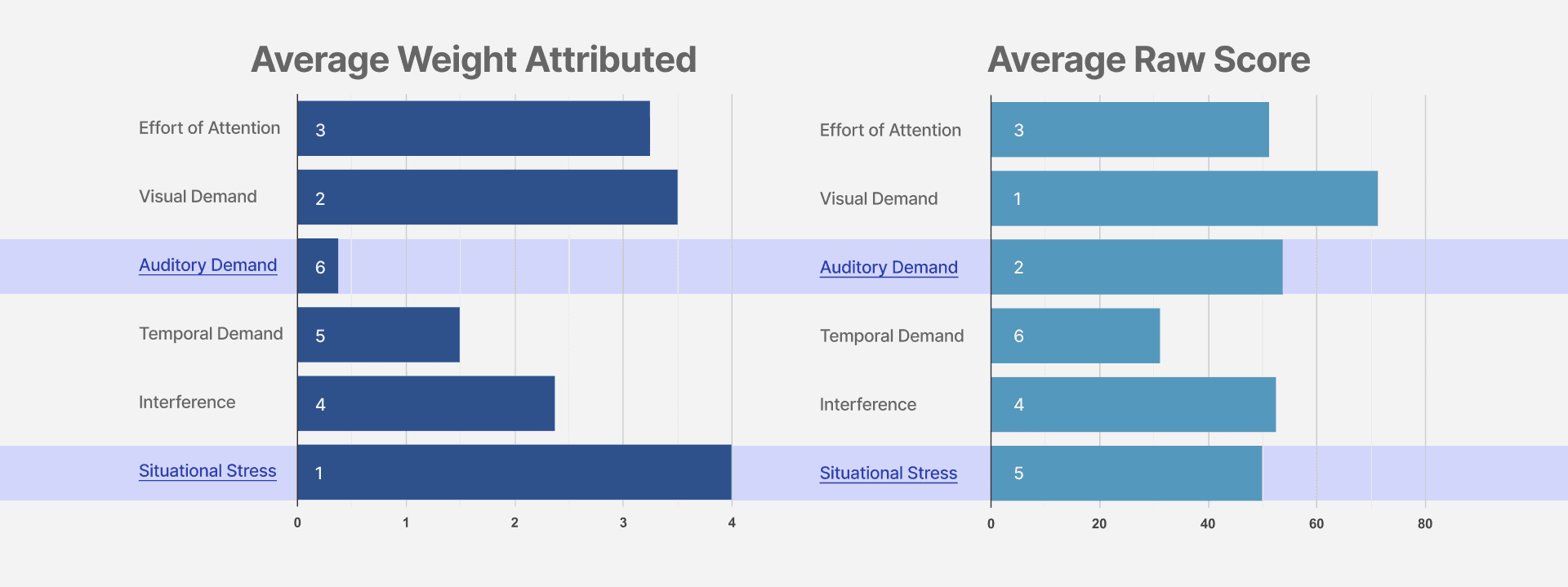
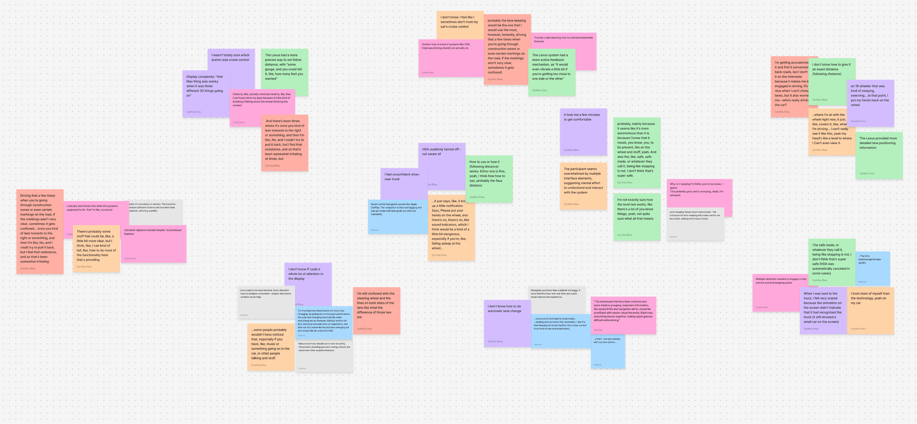
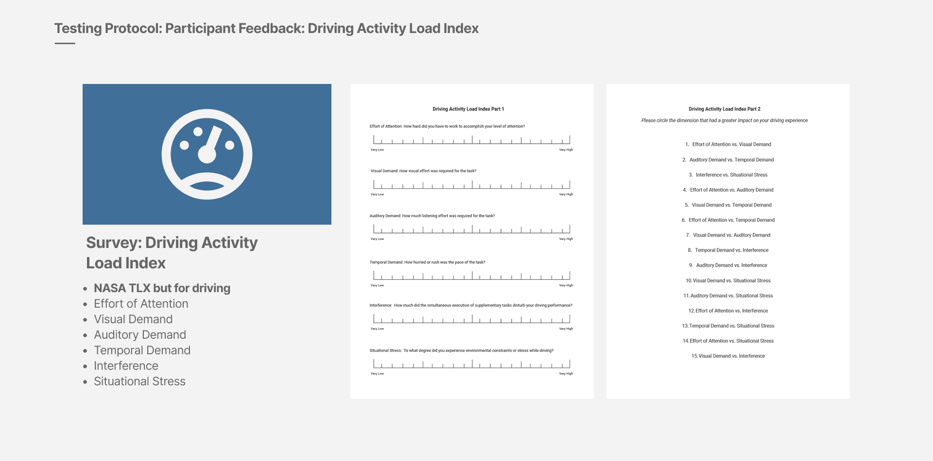
The Driving Activity Load Index captured attention, visual and auditory demand, time pressure, interference and situational stress. We considered those responses alongside task observations and biometric data, then organized the feedback into an affinity map. Exploratory comparisons between simulator and car measures informed the next study round.
05
Three gaps in the existing interface
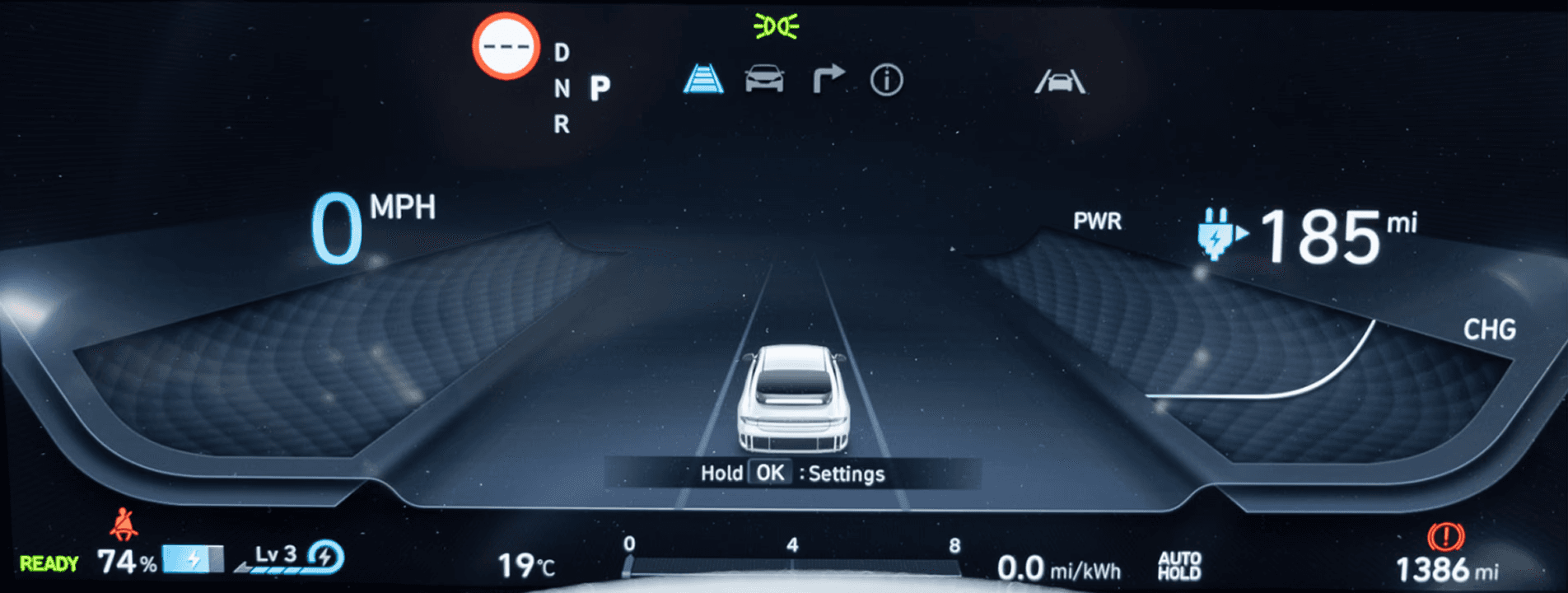
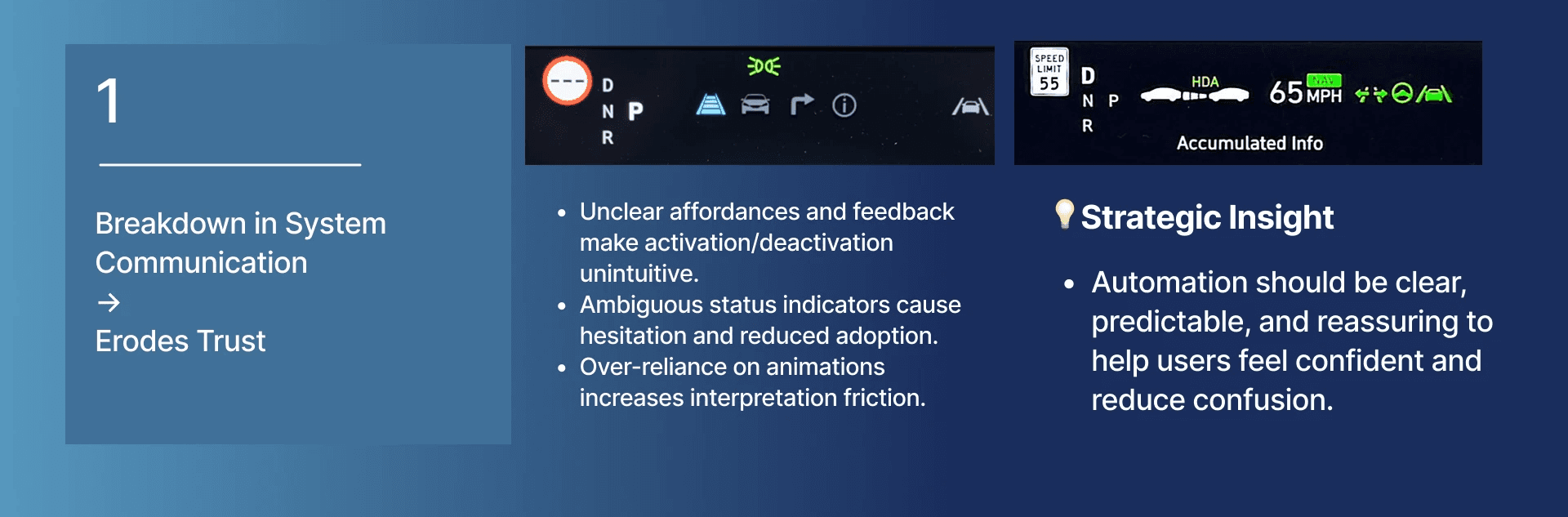
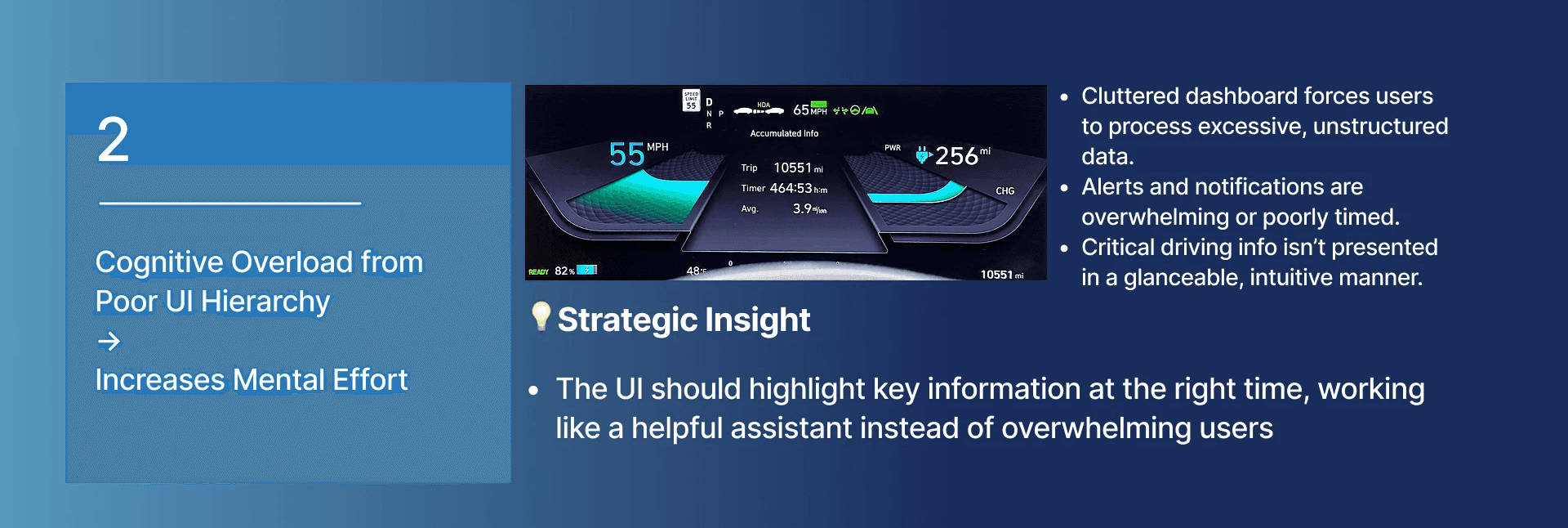
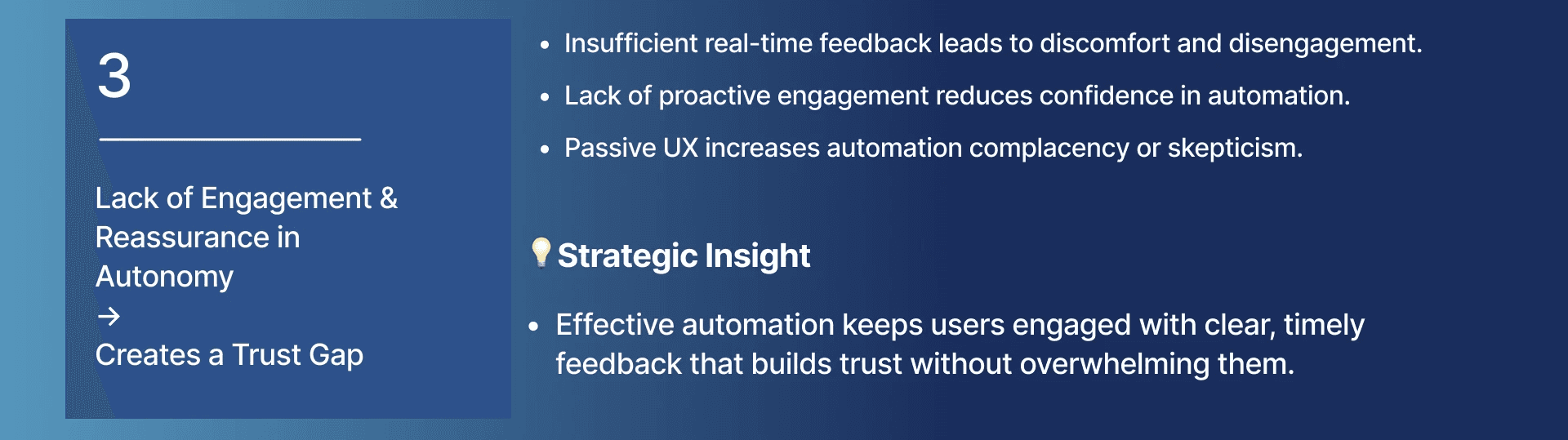
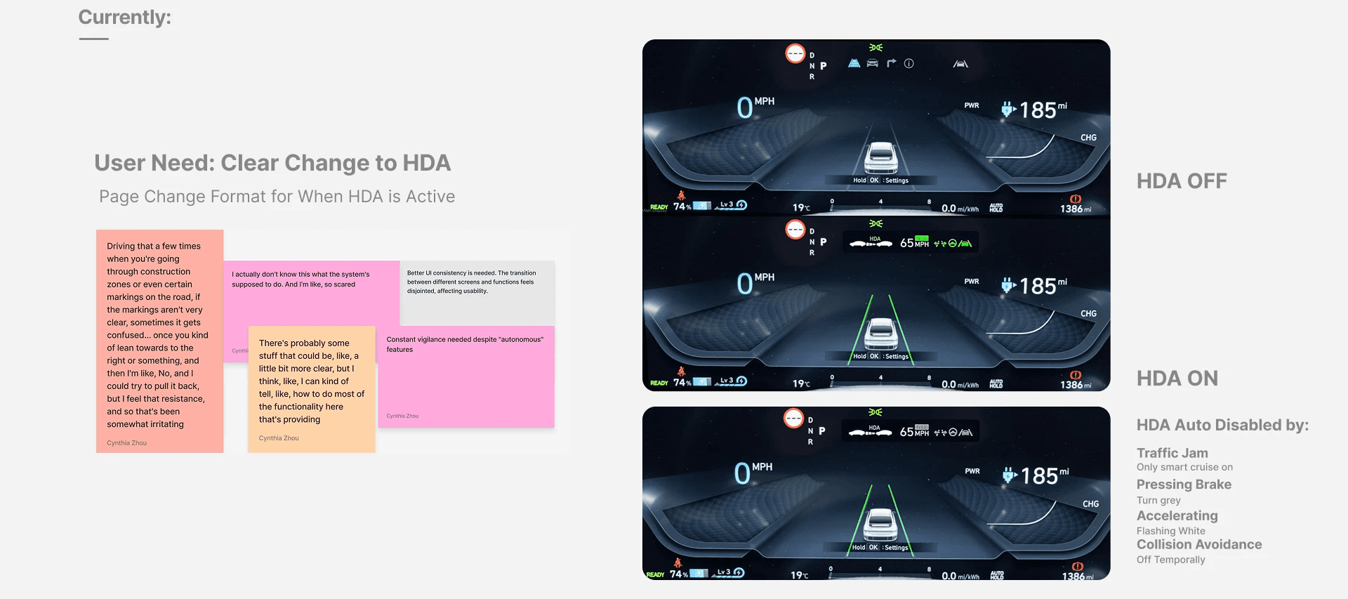
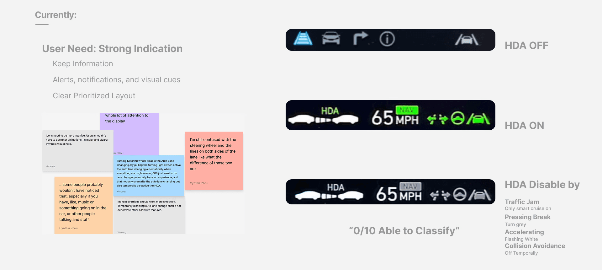
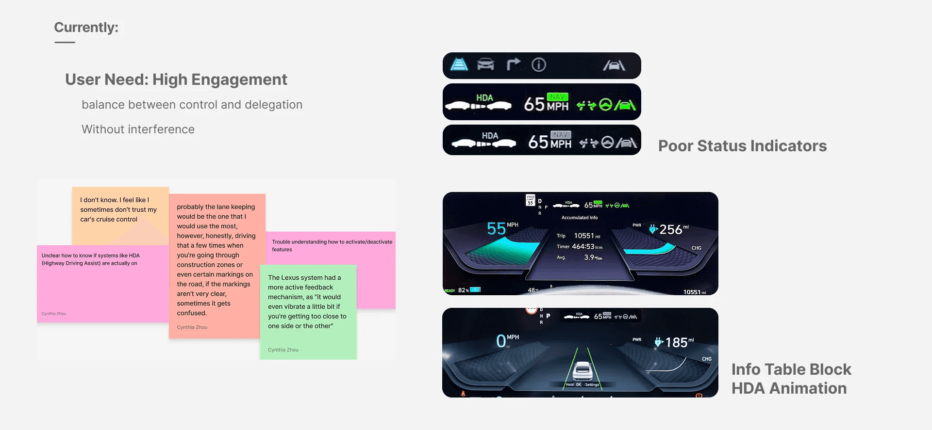
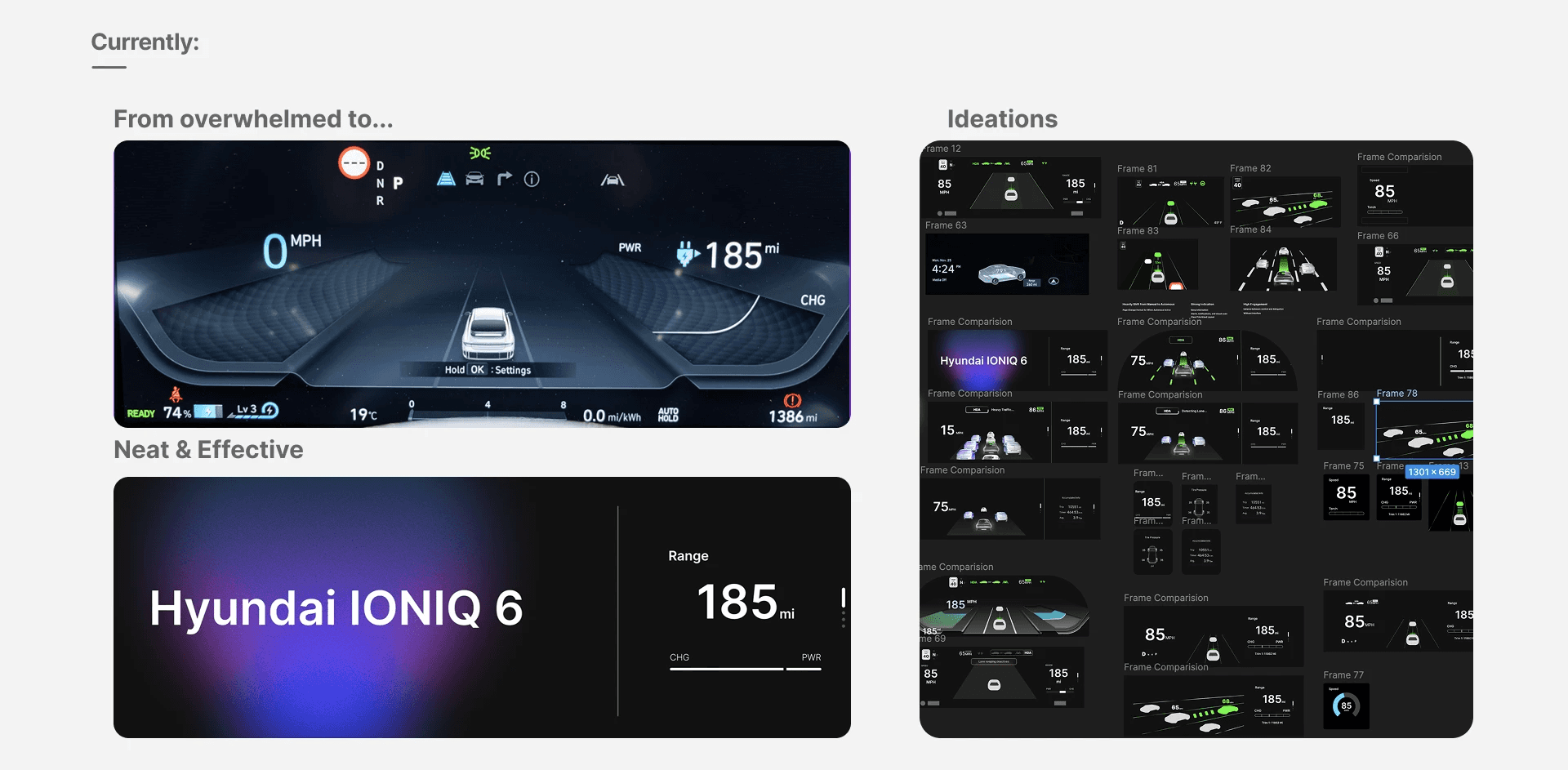
Round 1 surfaced three connected problems: ambiguous activation and status cues, a cluttered visual hierarchy, and too little timely reassurance about what the assistance system was doing. Together, these made handoff moments harder to interpret. The design opportunity was to communicate the right state and the right information at the moment it mattered.
06
Turn research into interface requirements
The first requirements were concrete: make entry into and exit from HDA visible, distinguish active and interrupted assistance, and keep important feedback readable without obscuring the driving view. These requirements connected each pain point to a behavior the interface could communicate.
07
Explore the hierarchy before the visual finish
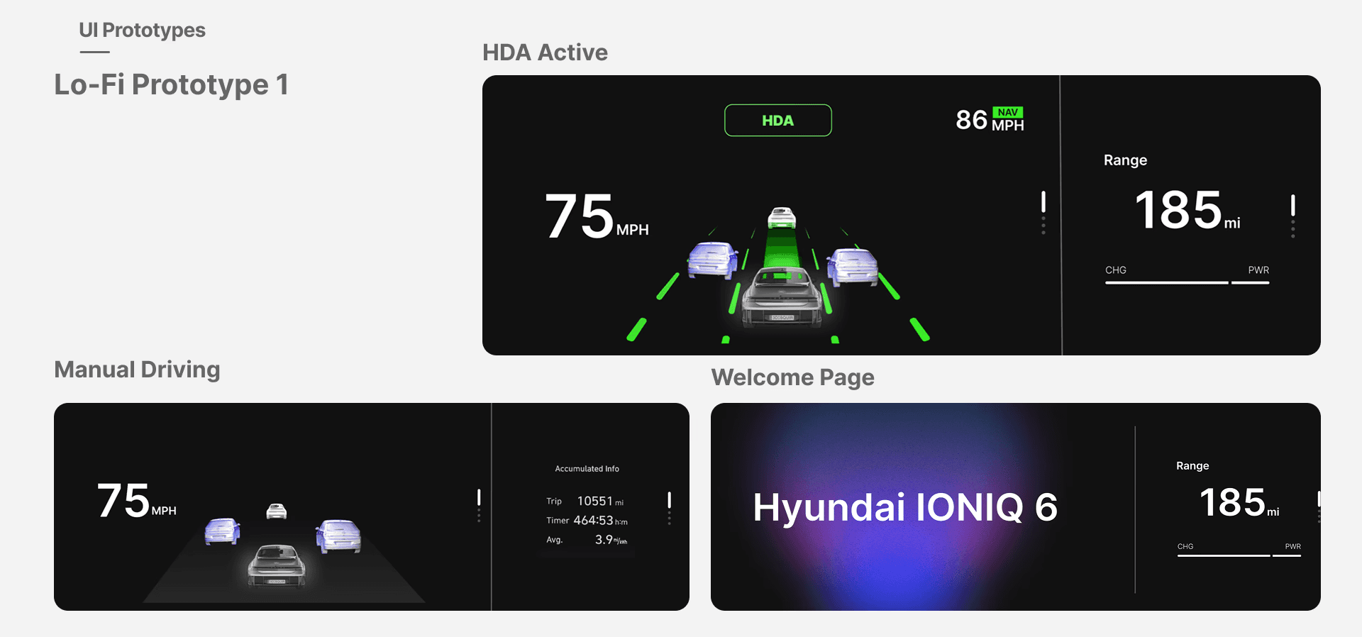
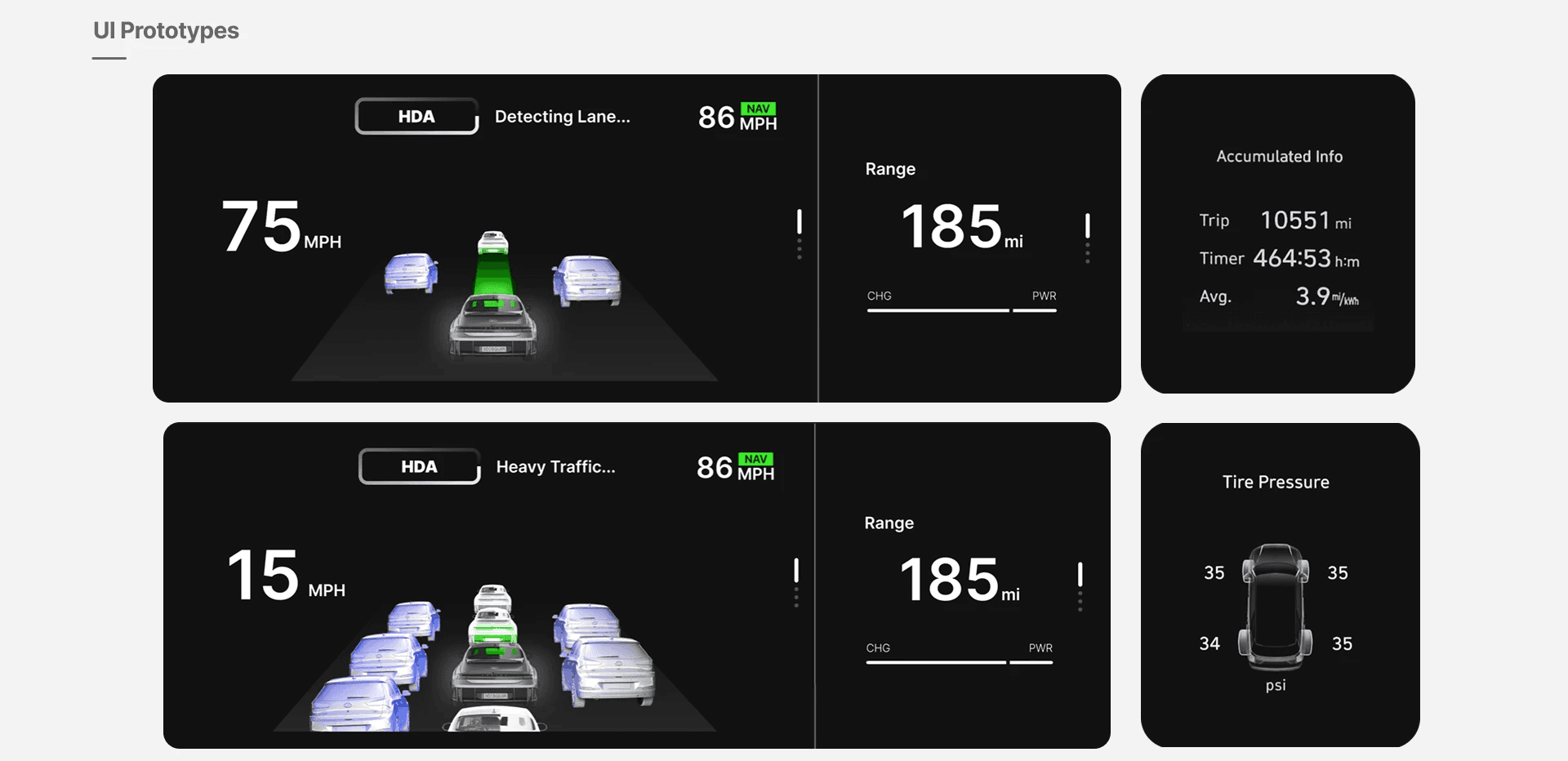
Low-fidelity prototypes separated driving status from secondary information and explored layouts for manual driving, active assistance, lane detection and heavy traffic. Comparing these states side by side made it easier to decide what should stay stable and what should change with the driving mode.
08
Iterate across states, not just one screen
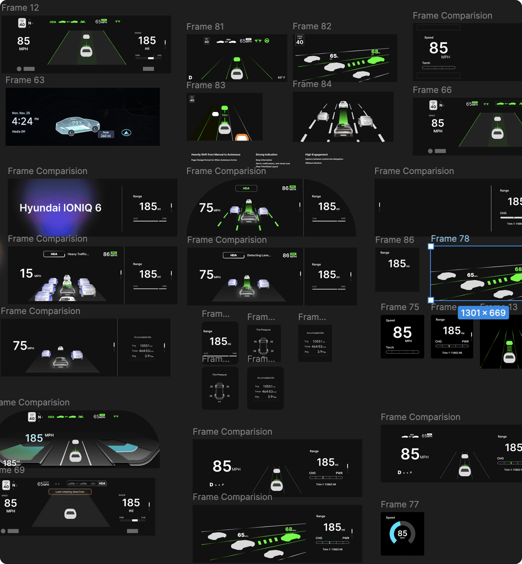
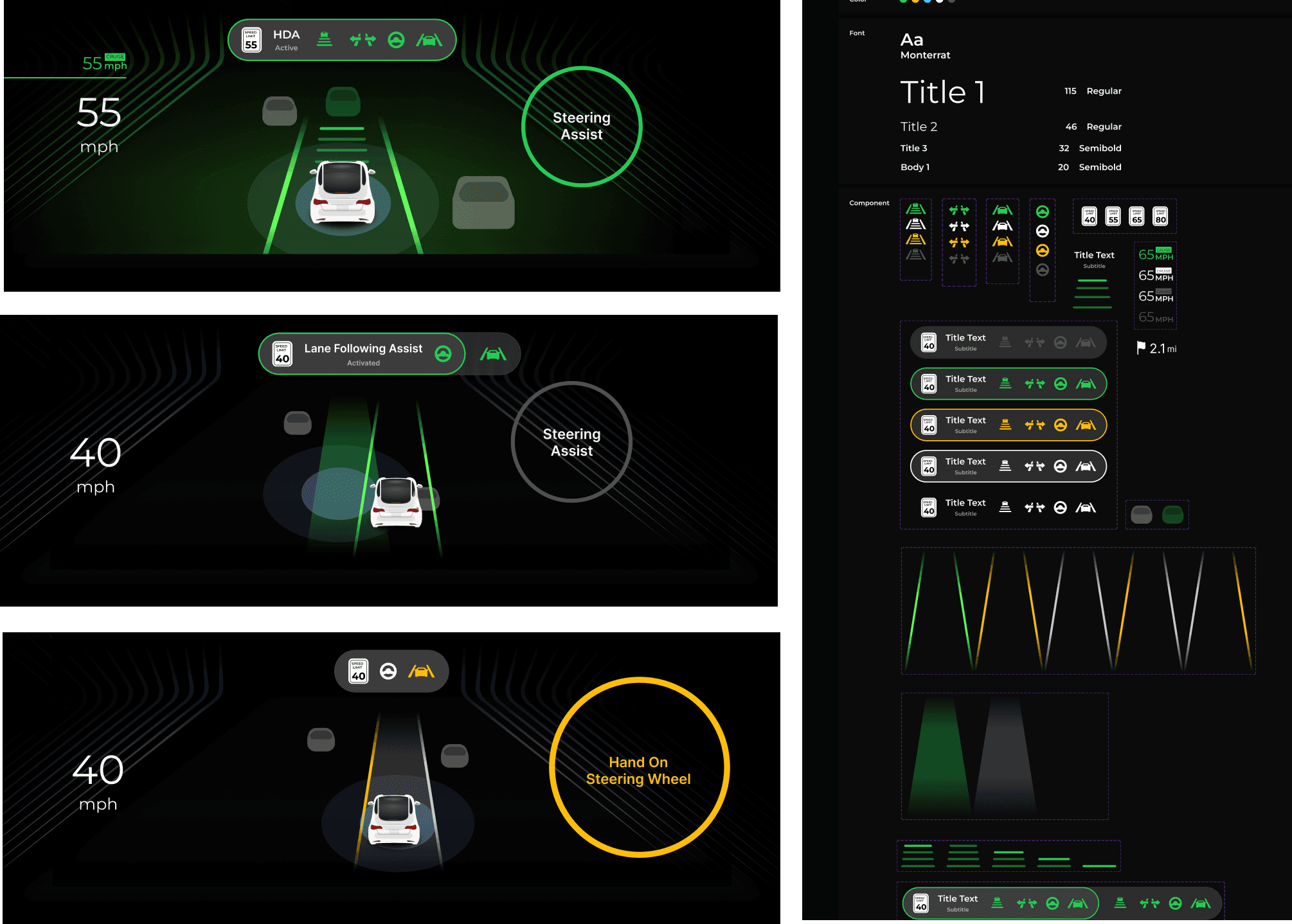
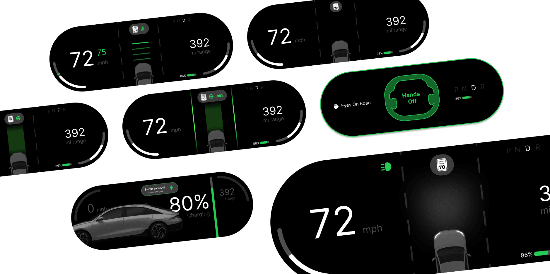
The exploration expanded into a family of instrument-cluster states. Layout, vehicle imagery, status treatments and feedback were refined together, so the proposal could communicate changes in assistance rather than only present a polished static view.
09
Build a consistent visual vocabulary
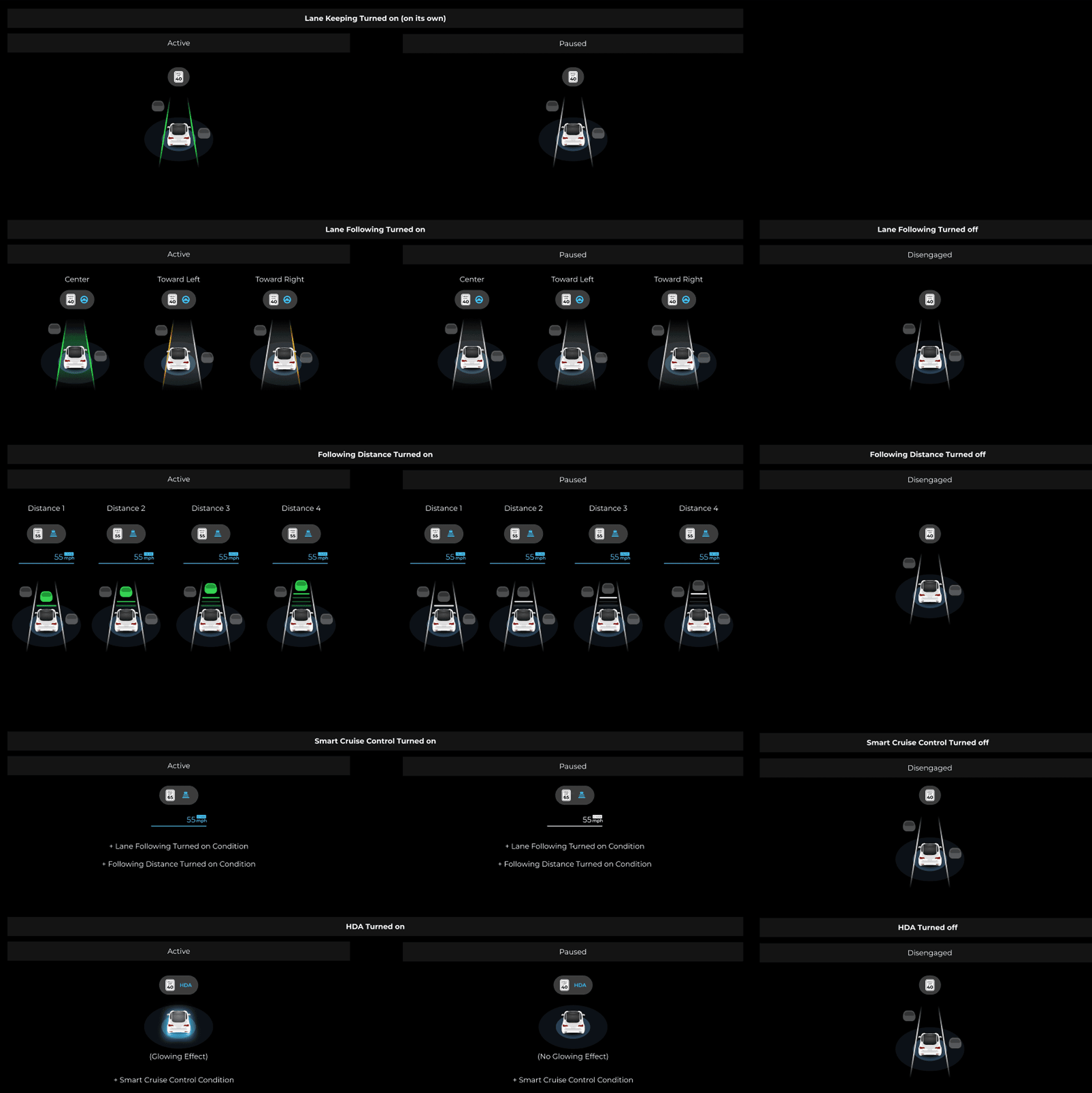
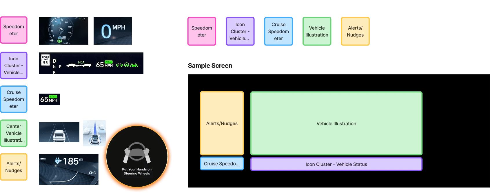
A shared system brought typography, icons, colors, vehicle illustrations and assistance components into one vocabulary. The component work focused on making the difference between normal operation, active support and a request for driver attention easier to recognize.
10
Test three directions
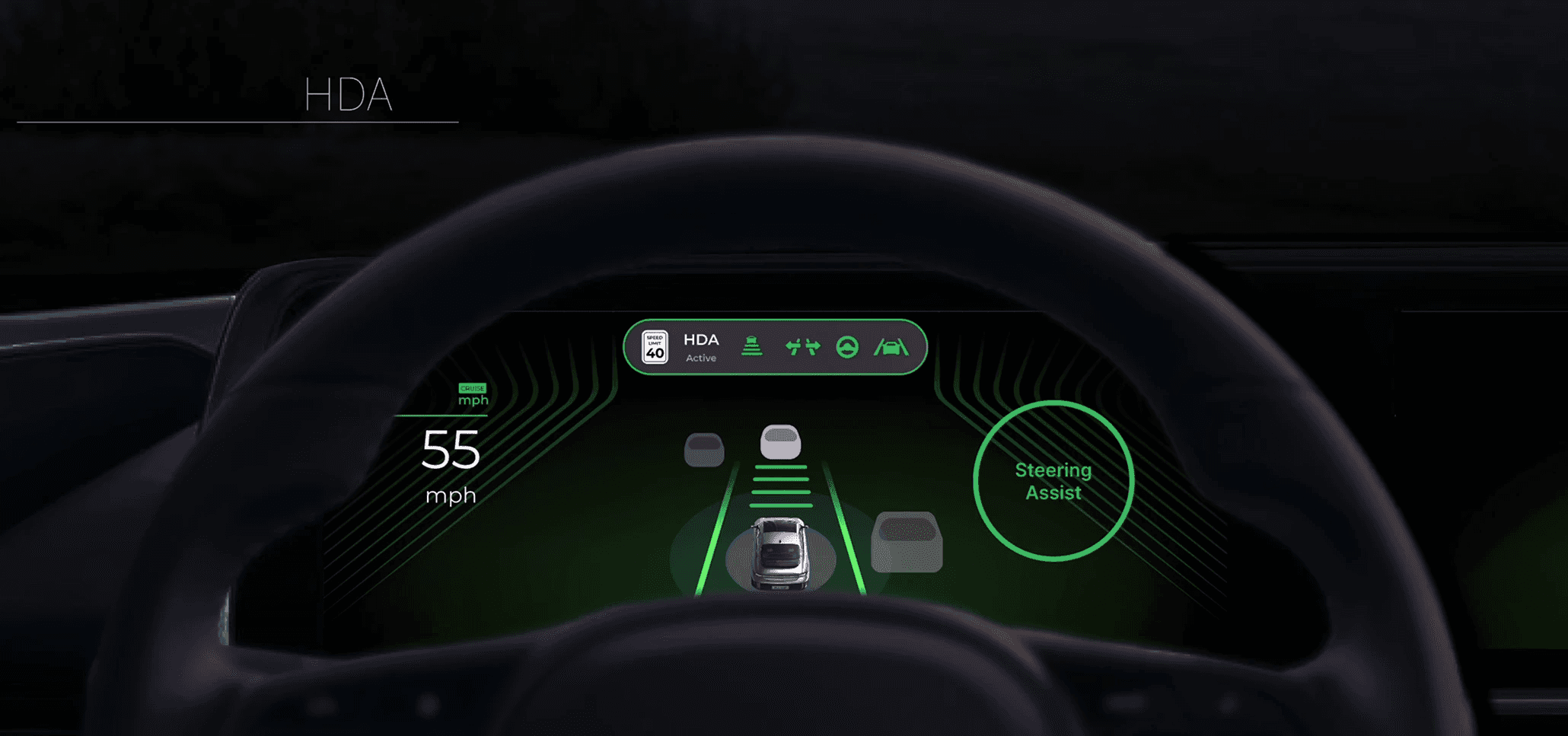
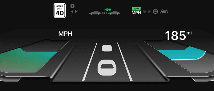
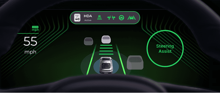
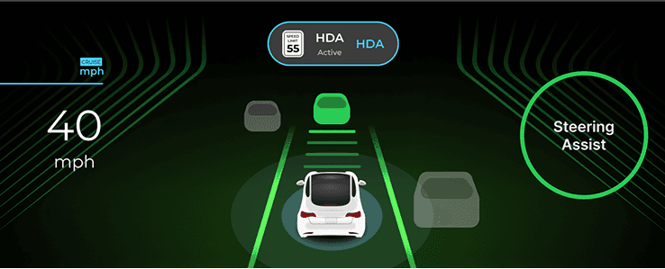
We developed three interface directions for comparison. White UI established a minimal baseline. Green UI emphasized reassurance and clear assistance feedback. Blue UI explored a more technical, information-focused presentation. The study compared these directions through driving tasks and participant feedback.
11
Round 2: compare, co-design and refine
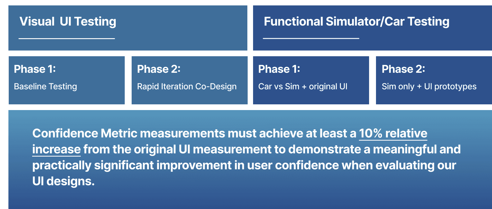
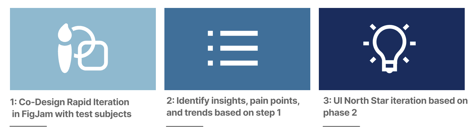
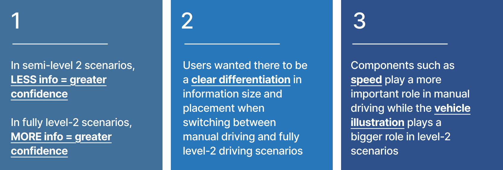
The second round combined visual UI testing with functional testing in the simulator and car. Whiteboard co-design let participants rearrange information and discuss what they needed in each driving mode. Their feedback pointed toward an adaptive hierarchy: speed mattered more during manual driving, while the vehicle visualization became more important with assistance engaged.
12
Make confidence measurable
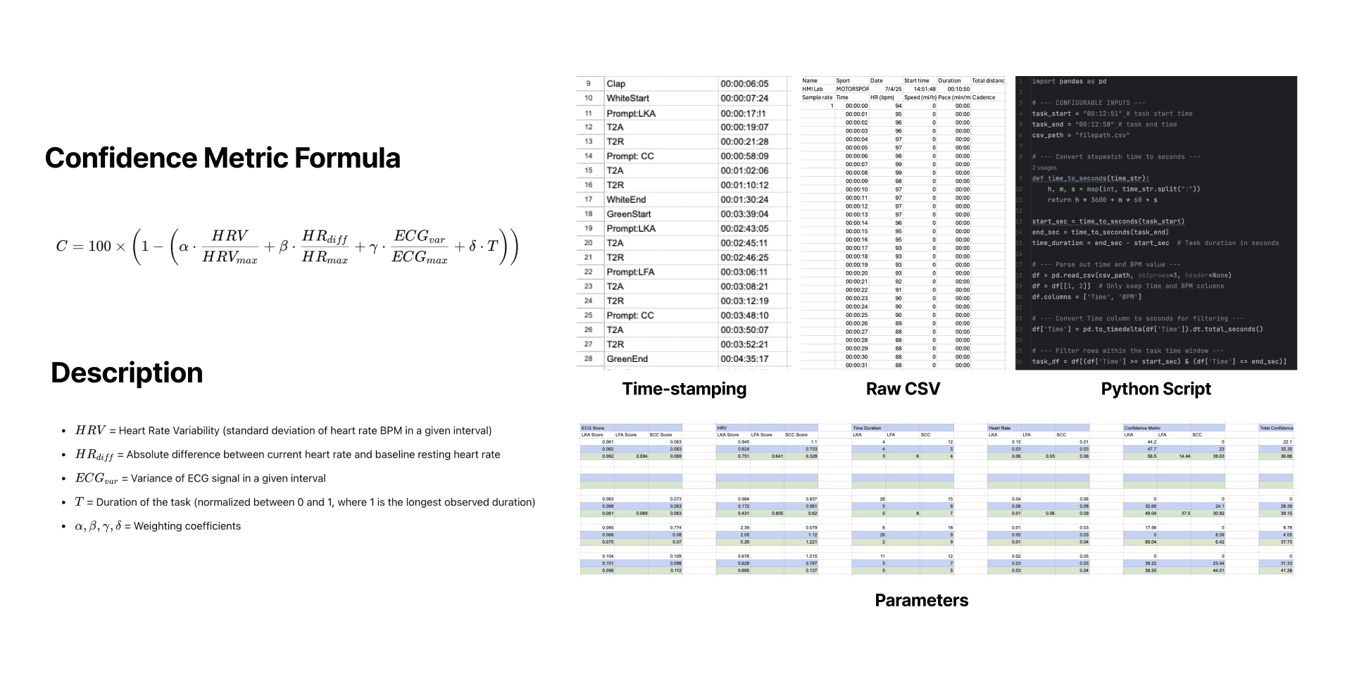
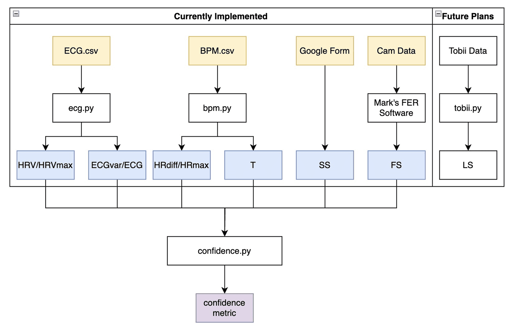
The study used a custom confidence score to bring physiological signals, task timing and self-report data into a common framework. The documentation records how data was prepared, aligned and weighted. The pipeline also separates implemented inputs from planned facial-emotion and eye-tracking extensions, keeping the measurement model open to further development.
13
Green UI led the prototype comparison
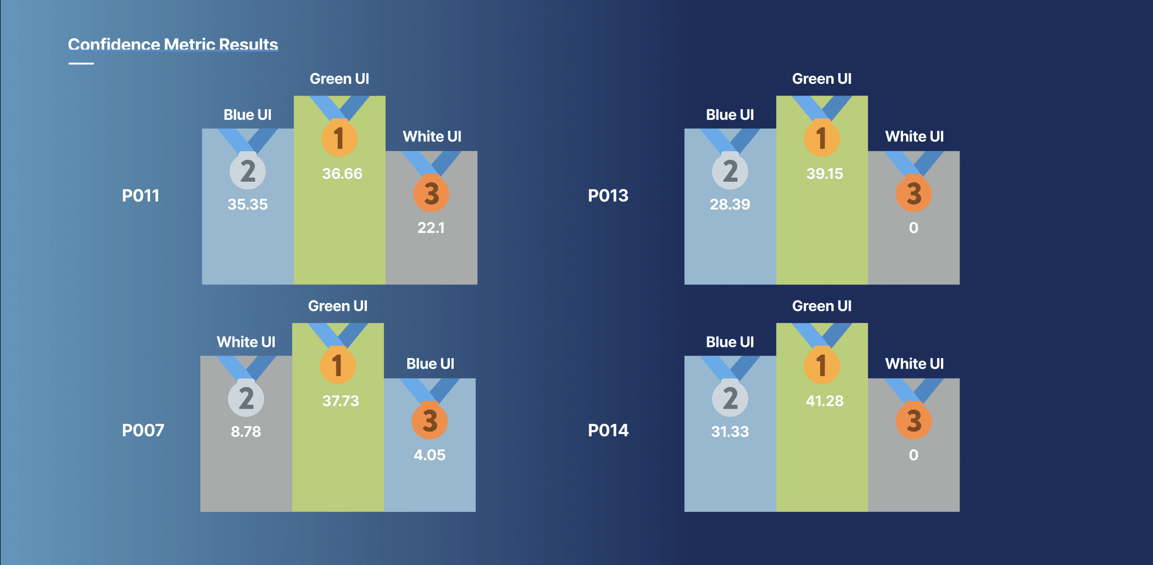
The project study reported that Green UI achieved the highest confidence score, with a 10% improvement over the original UI. The comparison charts show how the three directions performed for the participants shown. This result guided the final prototype toward clearer assistance states and information that adapts to the driving mode.
14
Compare simulator and real-driving measures
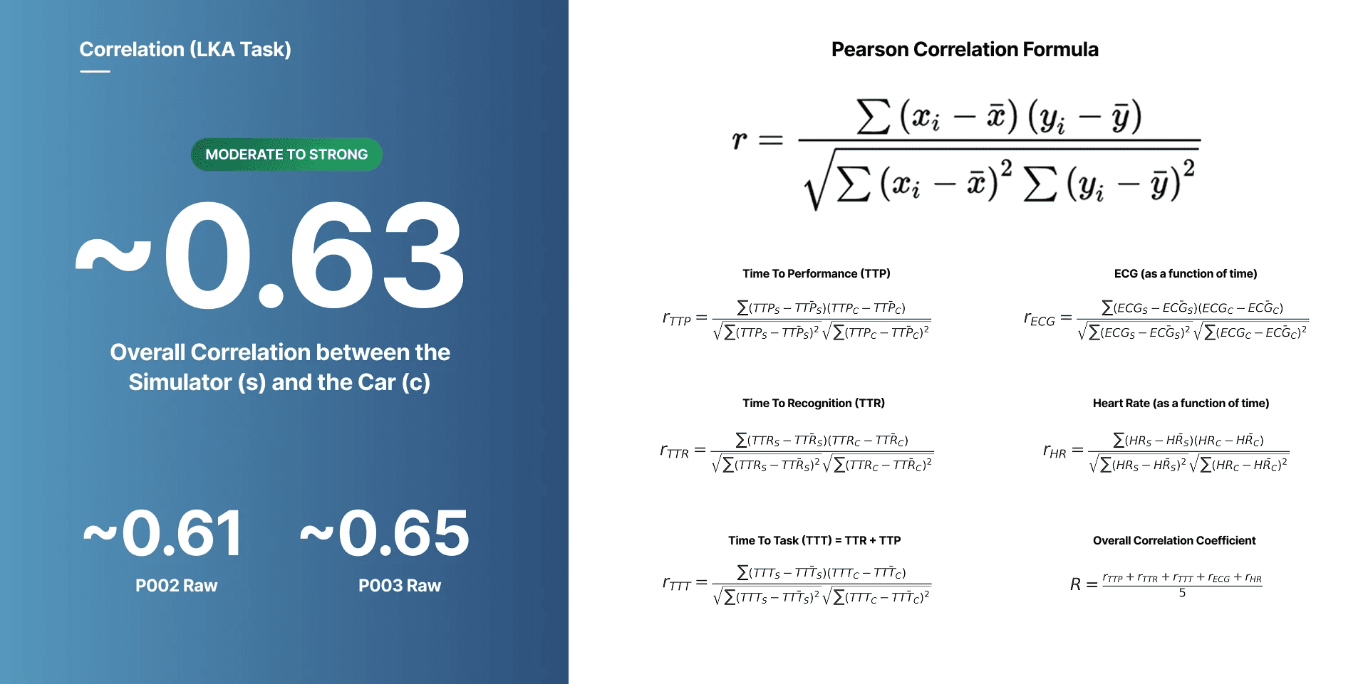
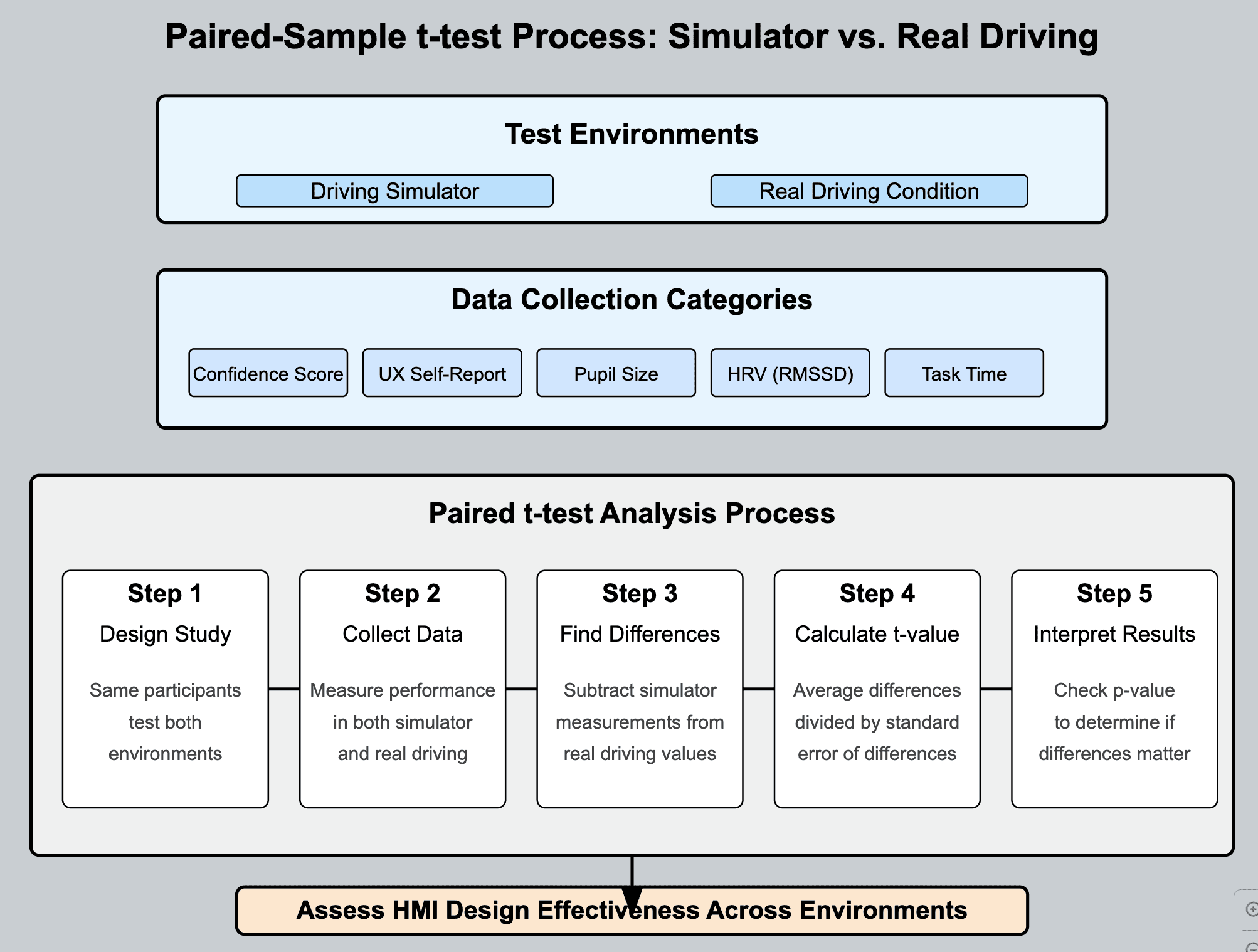
Paired-sample analysis compared simulator and real-driving measures from the same participants. The analysis considered confidence scores, UX self-reports, pupil size, heart-rate variability and task time, giving the team several perspectives on the experience across environments.
| Measure | Source | Focus |
|---|---|---|
| Confidence score | Custom confidence metric | Reported certainty and comfort |
| UX self-report | Custom UI questionnaire | Usability, clarity and satisfaction |
| Pupil size | Tobii Pro Glasses 2 | A signal considered in cognitive-load analysis |
| HRV (RMSSD) | Polar Beat ECG | Physiological variation during driving tasks |
| Task time | Simulator and real-car interaction logs | Time and friction in completing tasks |
15
A clear system of assistance feedback
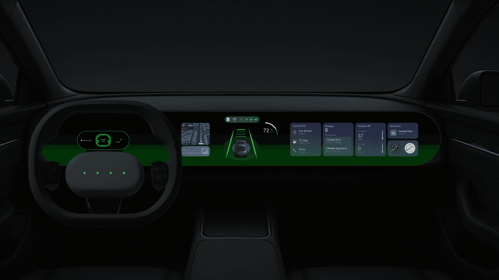
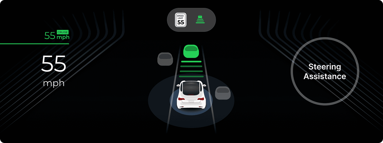
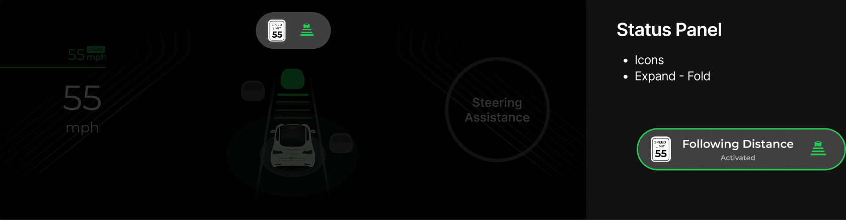
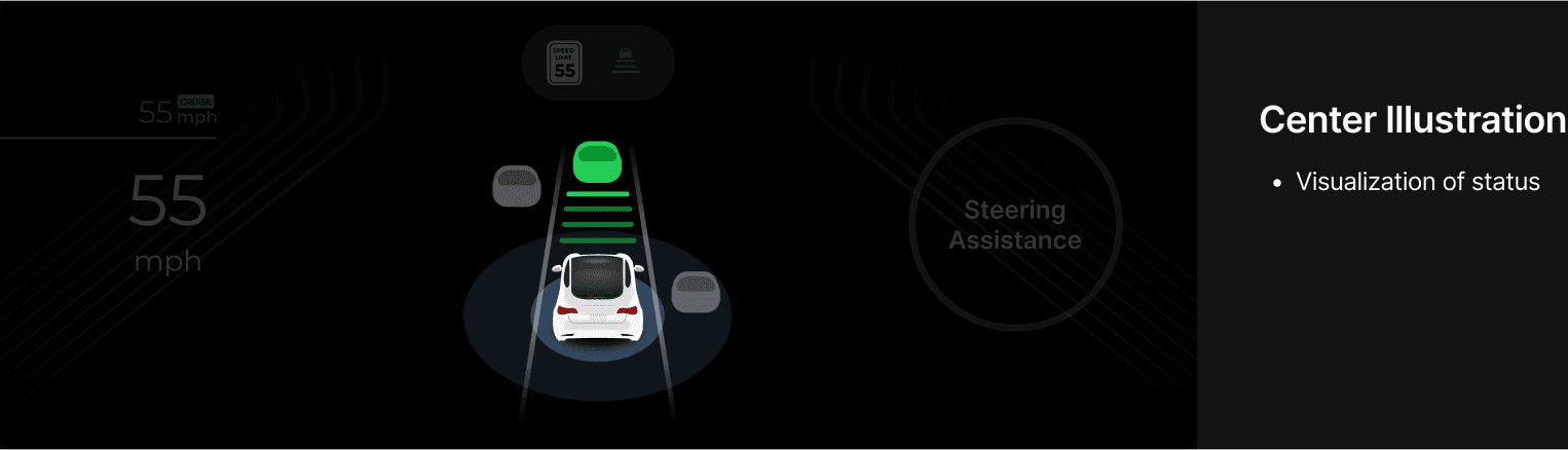
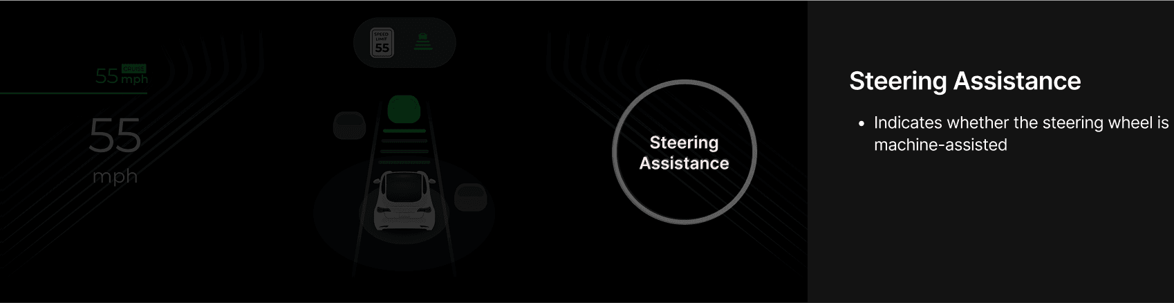
The final Green UI brings together a compact status panel, a central vehicle illustration and a dedicated steering-assistance indicator. Dynamic icons distinguish paused and active states, while lane-keeping and following-distance feedback keep the assistance behavior visible. Information density changes with the driving mode.
16
See the prototype in motion
Three prototype sequences show the Green UI in motion, extending the component system into changes of state and feedback over time.
17
North Star: bring feedback closer to the driver
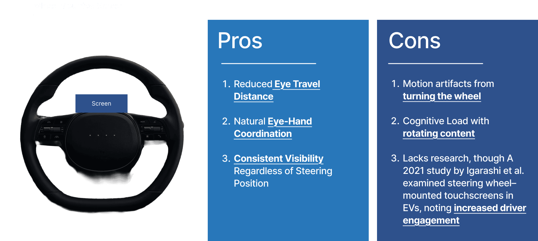
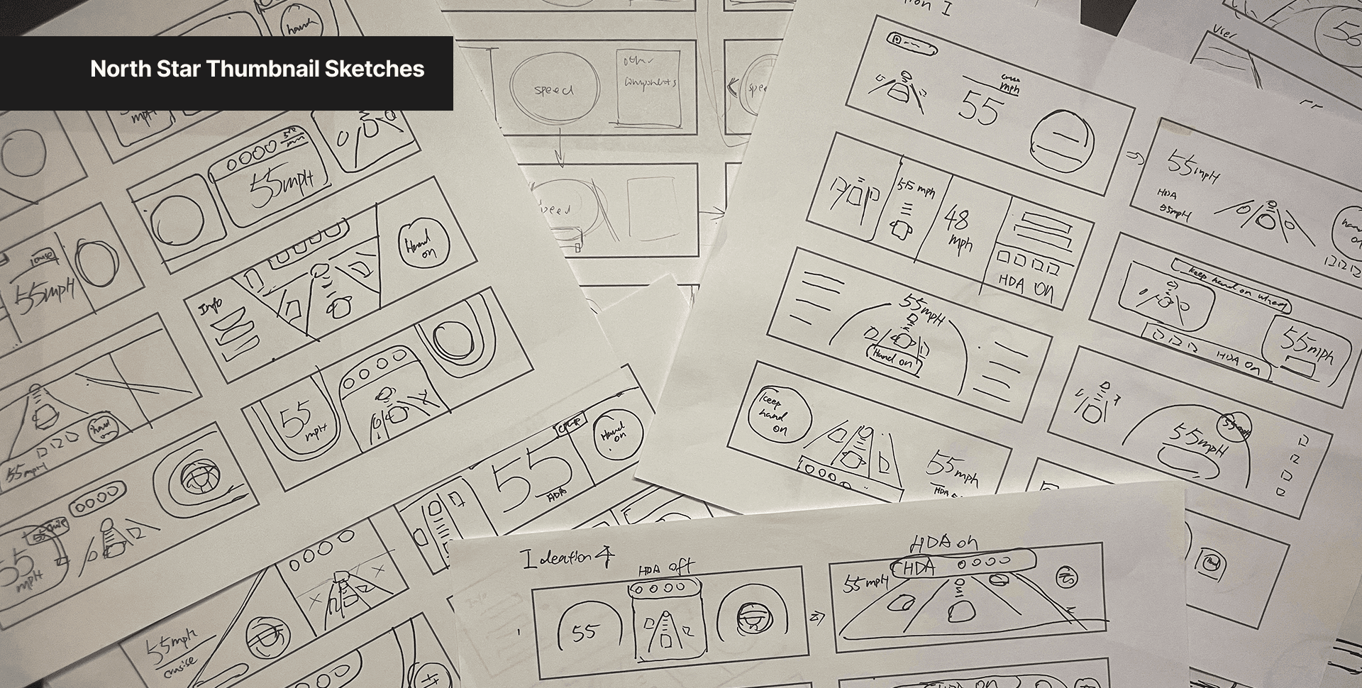
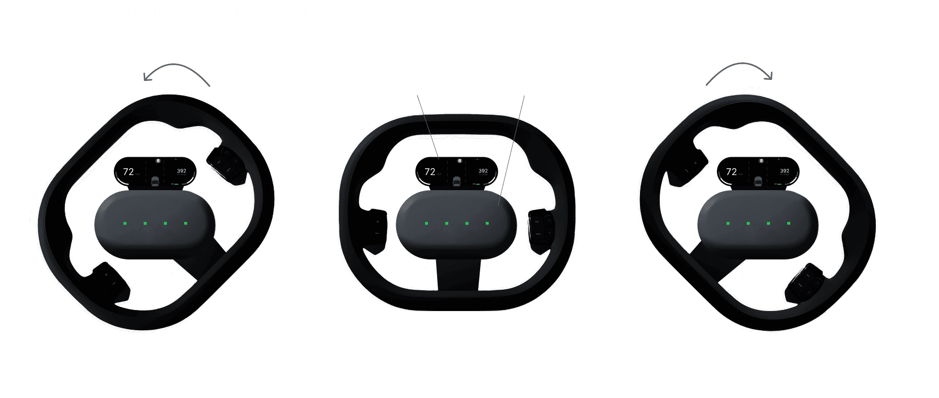
The North Star concept explored a steering-wheel-mounted display and a fixed central screen within the turning wheel. Sketches and screen studies considered shorter eye travel and more immediate feedback, alongside the challenges of motion, rotating content and cognitive load. This remained a concept for further exploration.
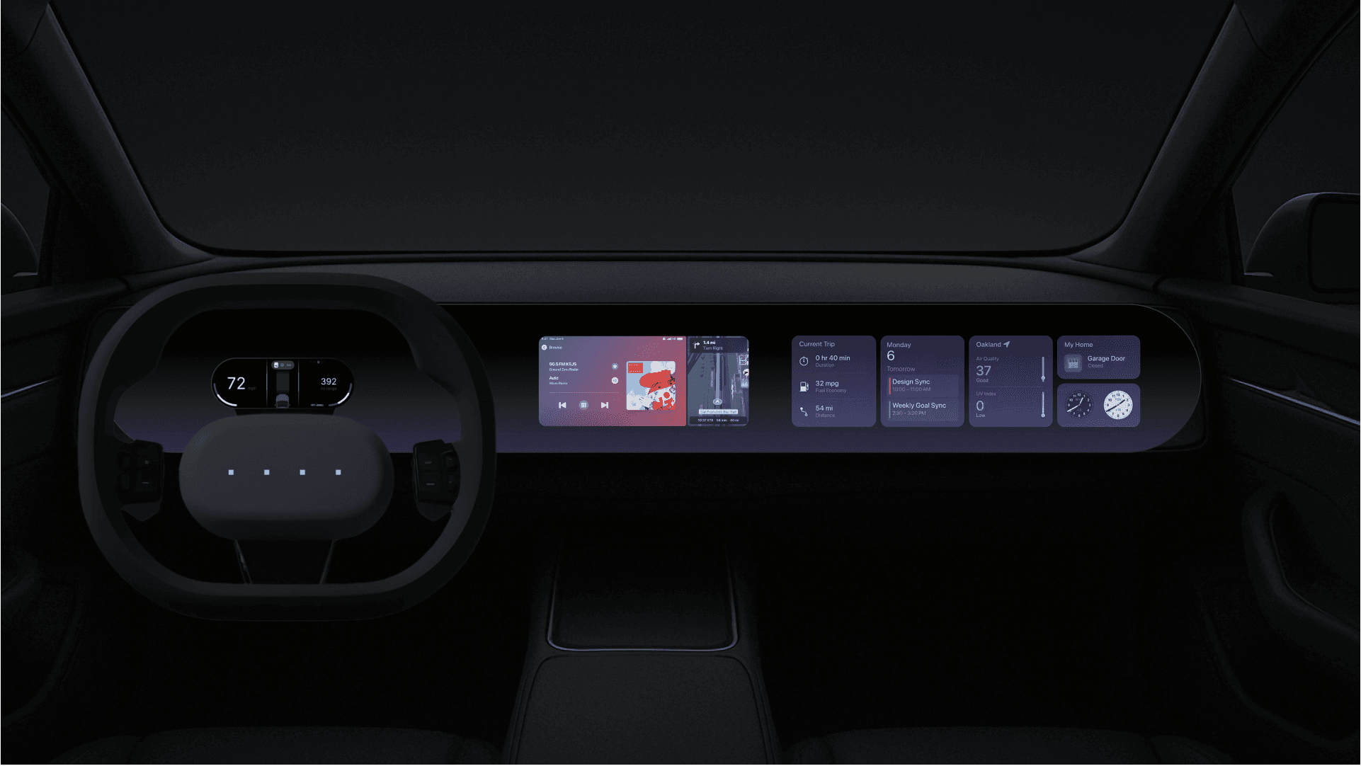
18
The next study environment
The cabin visualizations bring the steering-wheel concept and main display into a wider interior experience. Next steps were to improve simulator–UI integration, create opportunities to learn the assistance system through interaction, and add a more complex cityscape. Further testing with drivers familiar with Hyundai vehicles would help examine the wide variation in feedback observed in this study.